Mobiflex
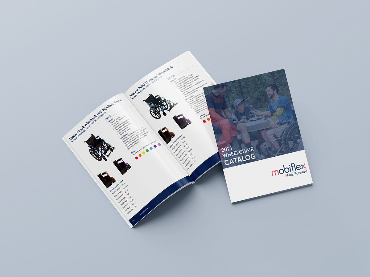
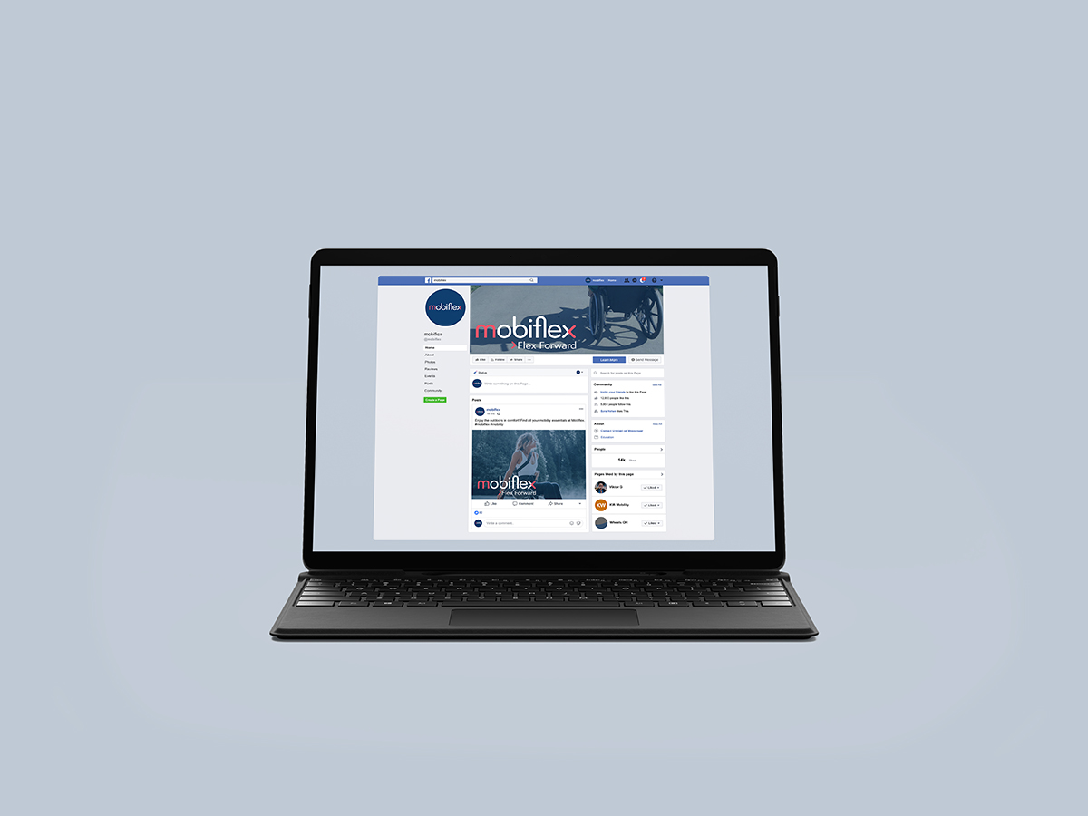
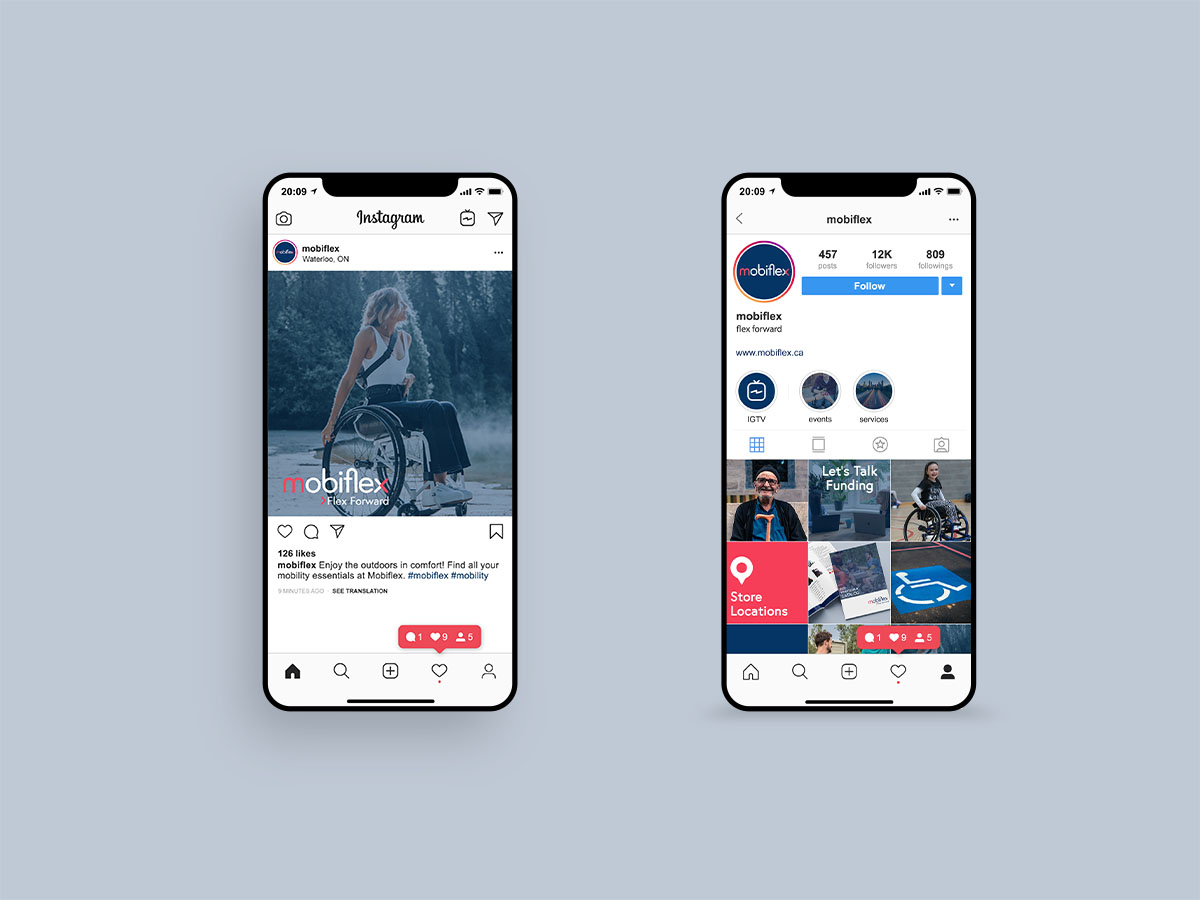
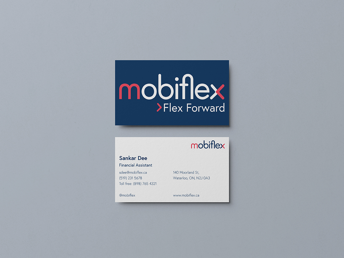
This is a design system project I did with Gawon Yoo. Our process included research, brainstorming, and sketching to land on the design for the MobiFlex logo. In addition to working on a logo, I also designed a wheelchair catalog for the company. The target audience for MobiFlex is people of all ages who need assistance managing their mobility. MobiFlex has a modern approach making it more inviting for all consumers. It does not necessarily look like a medical company or something just for older folks. The rounded typeface and use of lowercase letters have a friendly approach, suitable for a business that is trying to make others feel as comfortable as possible. The round counters and curves also correlate to wheels which are recognizable in the company’s products and services. The curved, overlapping ‘x’ represents the action of flexing or bending and how movement can make things overlap or intertwine. The salmon pink in the logo is lively while also being warm and friendly. It attracts a wider audience and also stands out against competitors that use more muted and cool–tone colours. The dark blue is a suitable base for the pink allowing for decent contrast. Additionally, blue is a common colour in the mobility industry, so the colour scheme isn’t completely outside the box. The logo is a modern and refreshing design for mobility products.