HILL & SONS BEVERAGE BRANDING
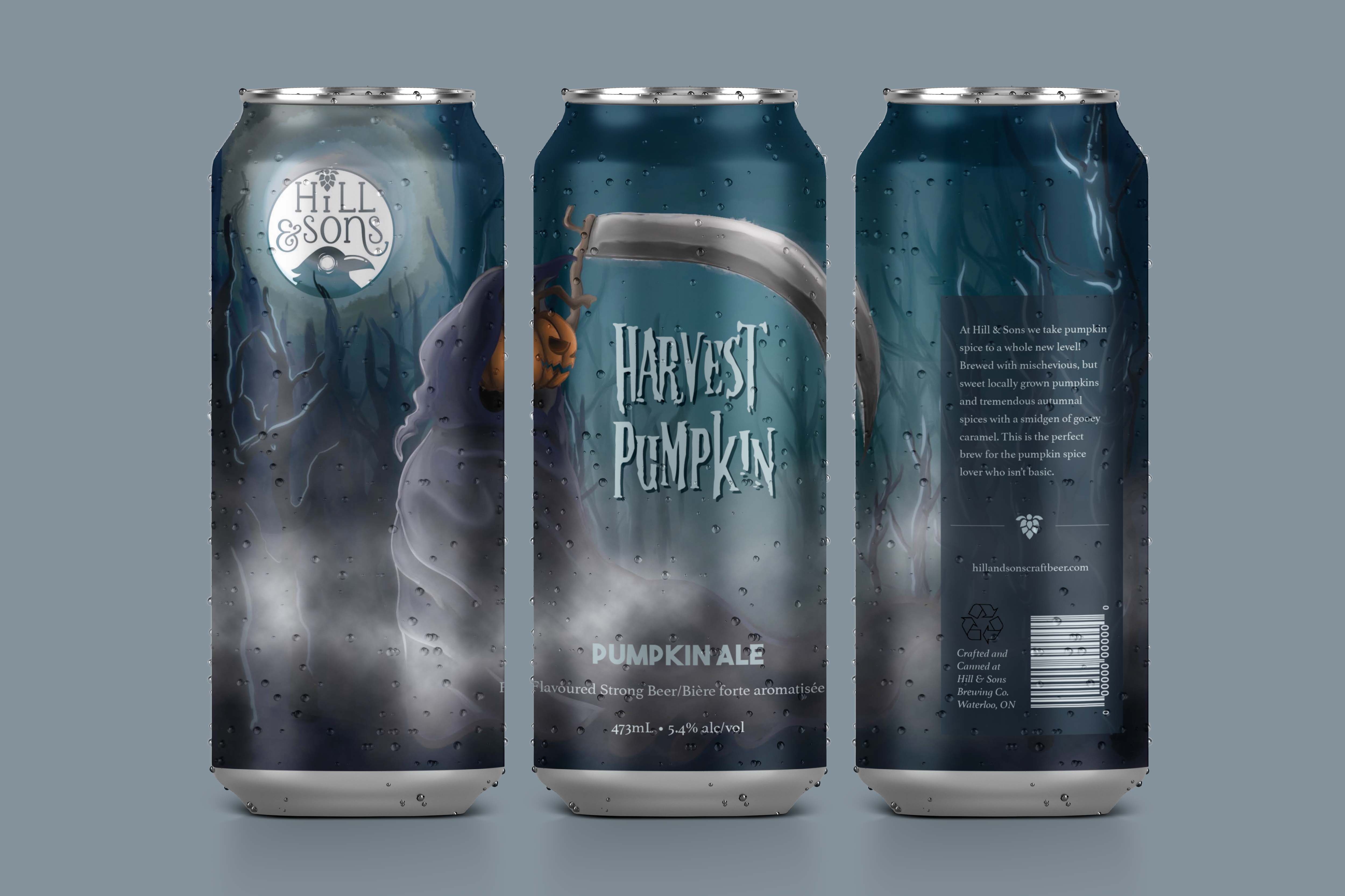
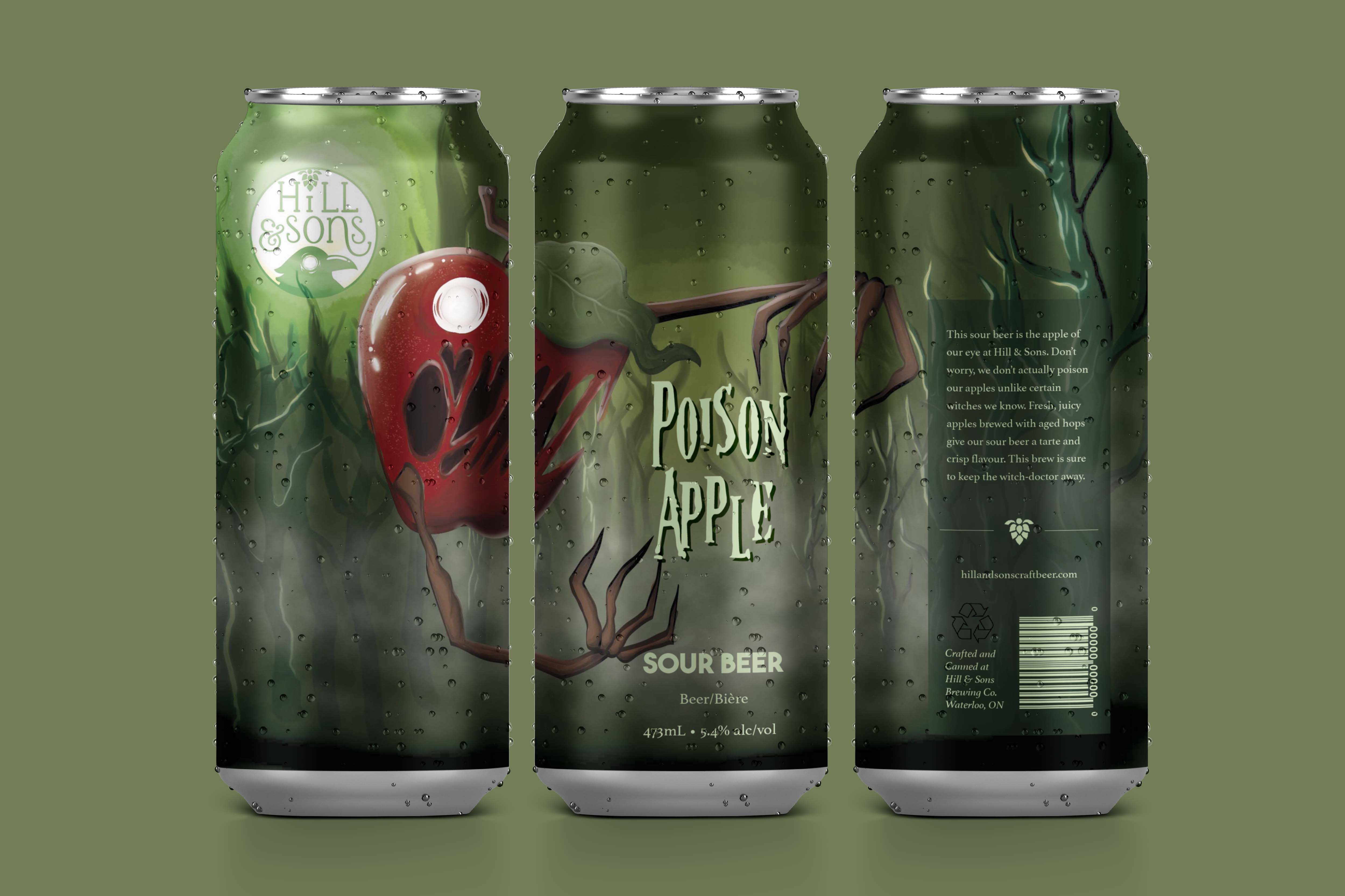
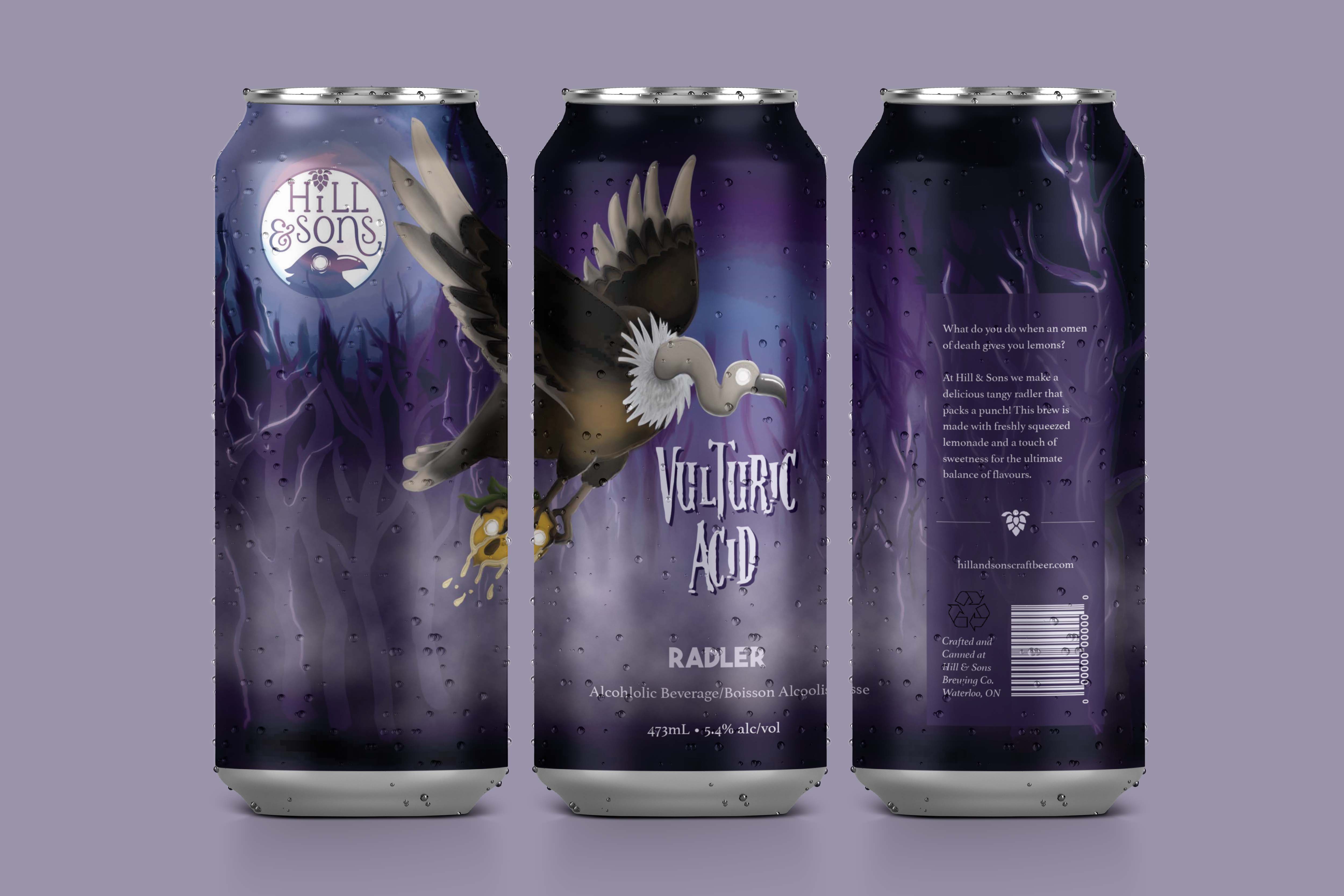
This project was designing a brand for the fictional craft beer company Hill & Sons. This was a school project for Conestoga College. The goals of this project were to put to practices the packaging and design skills and techniques that we were taught in class. This project became a piece for my portfolio because the beer can designs demonstrate my illustrative skills and knowledge on proper alcohol packaging procedures.
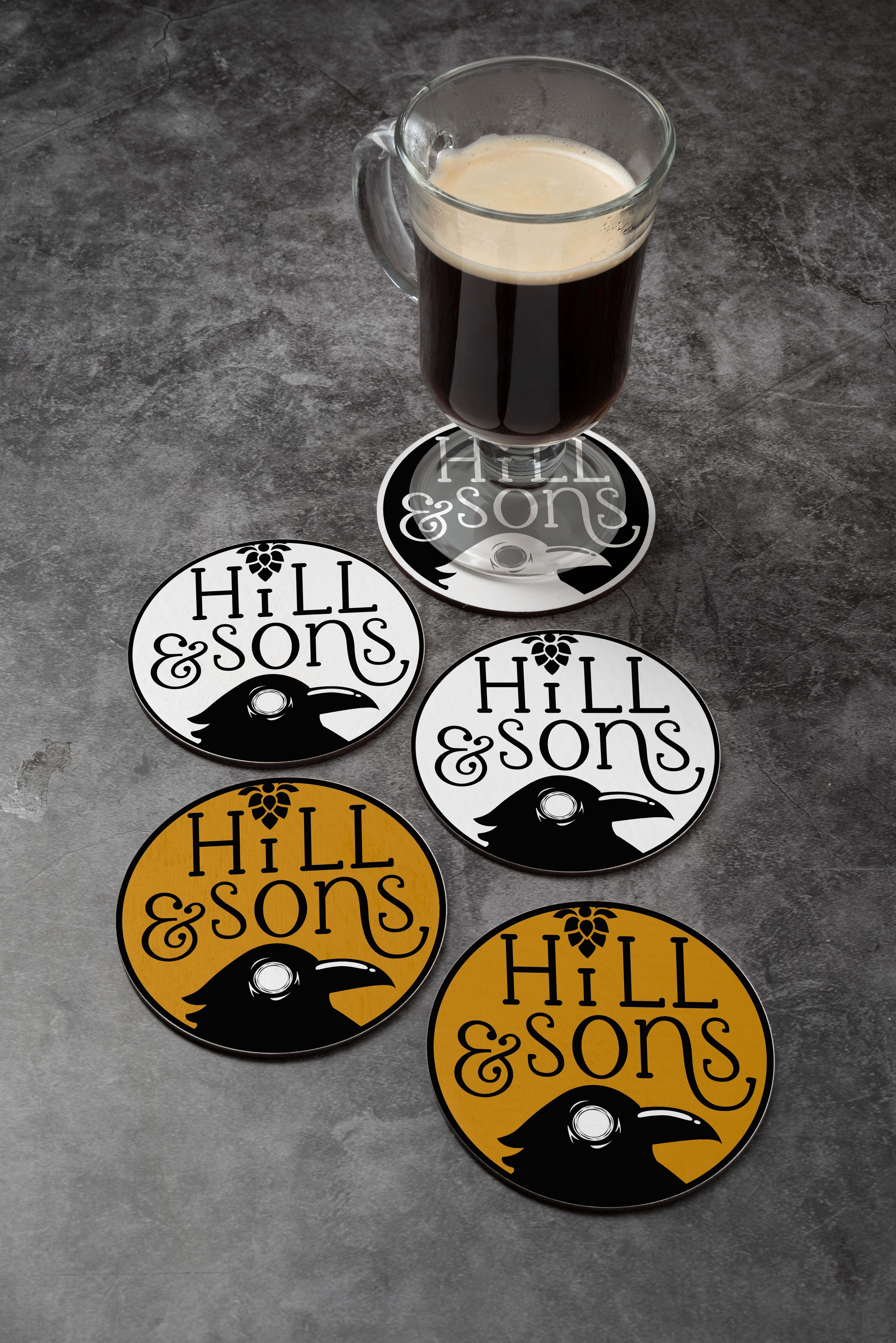
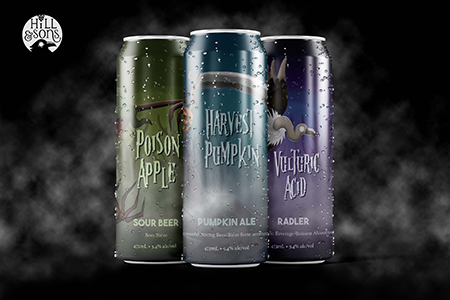
There were many aspects and segments of this project which included designing a logo, three beer cans, and a brand guide. I used digital illustration for my beer can designs, and I created my own type and vector image for my logo. My roles for this project included self-management, graphic design, and illustration. To create my illustrations for the beer can designs I used my Wacom tablet to draw the linework in illustrator. Then I brought that linework to photoshop and added the colours and textures to create the final look.
I chose the horror/Halloween theme for my can designs because they were seasonal, limited-edition flavours. The typeface I chose for the flavour names is a horror font that helps get the theme across while still being readable. During my resarch of horror typefaces I found that horror fonts are usually paired with bold fonts, and that is the reason why I chose a bold typeface as a secondary font. The most challenging part of this project was learning how to take my vector images to the next level. This was my first time using my Wacom tablet, so I learned how to use that to create more detailed illustrations. Also, I learned a lot of different techniques about digital illustration like using the right brushes and giving texture to my illustrations.