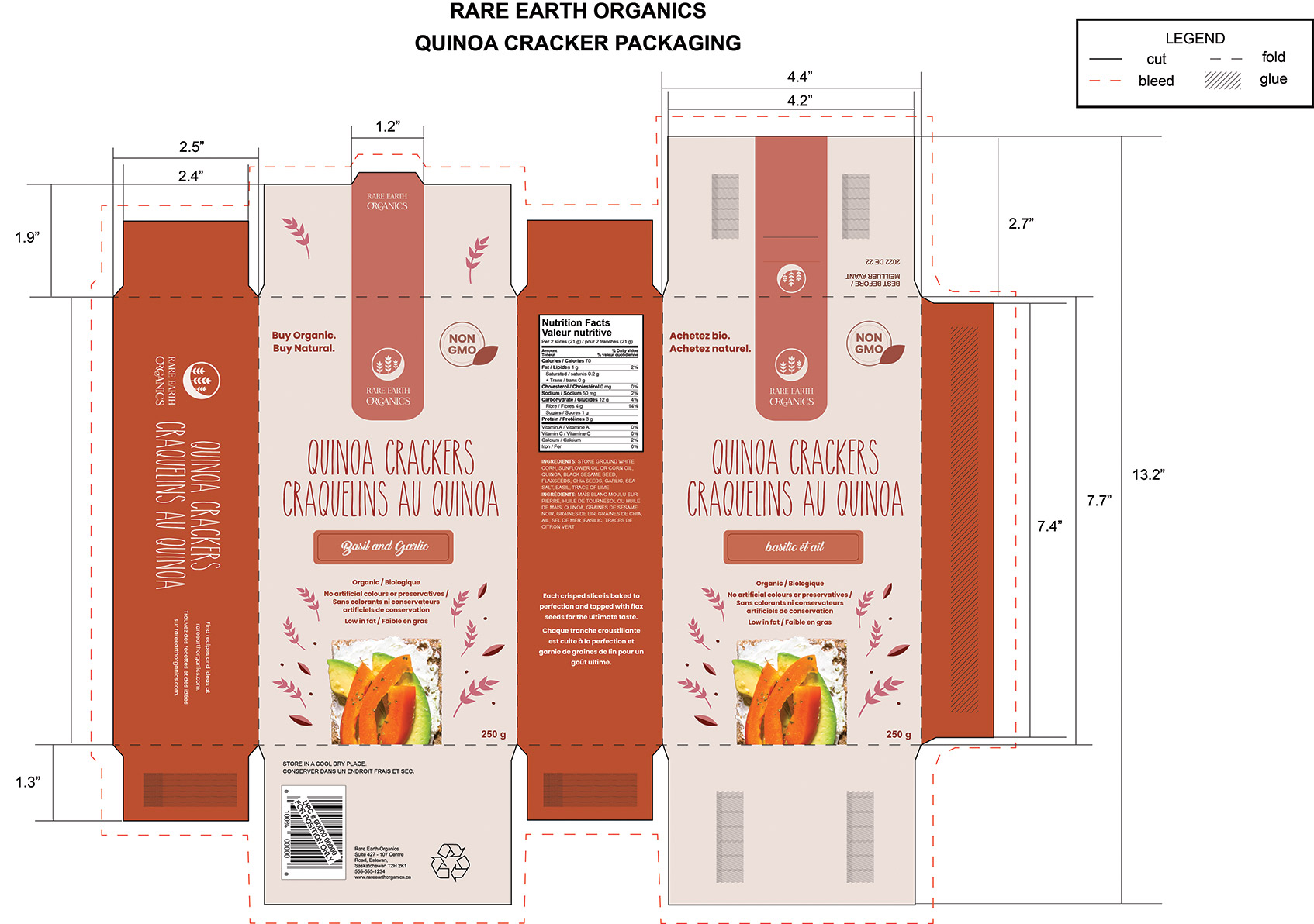
ORGANIC PACKAGING PROJECT
The purpose of this project was to create a package for a fictitious company that sells grain products. The components of this project include creating a logo, providing an idea for a product, choosing a colour scheme, and to ensure that nutrition facts and proper food packaging information were incorporated and made clearly visible on the package.
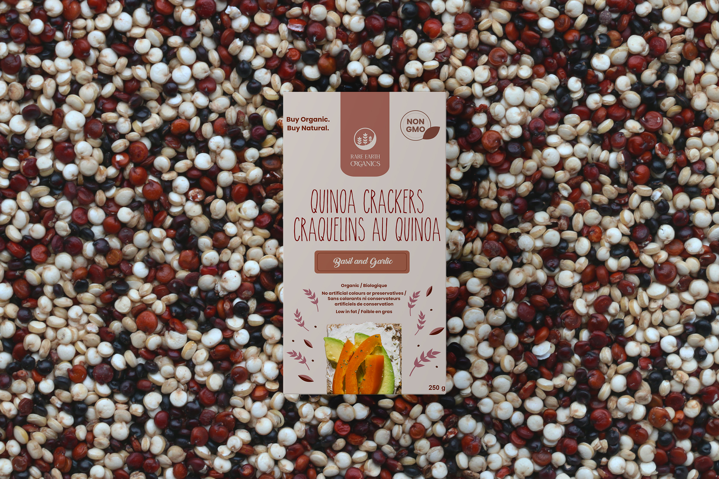
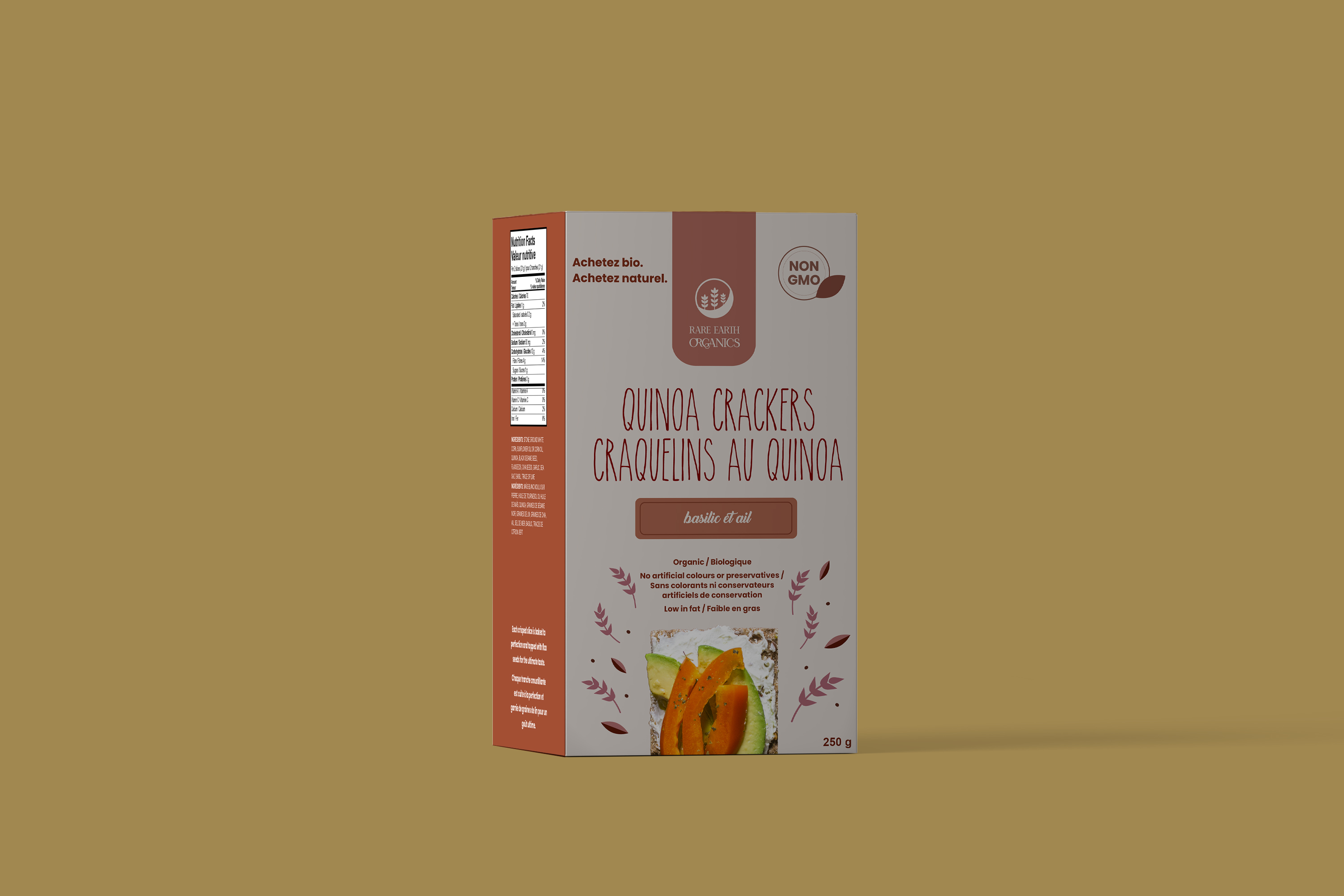
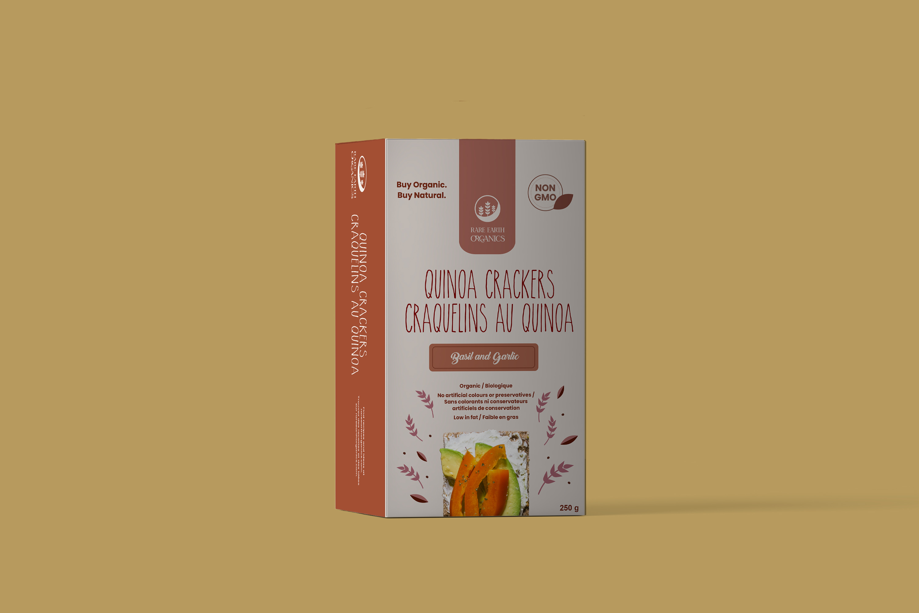
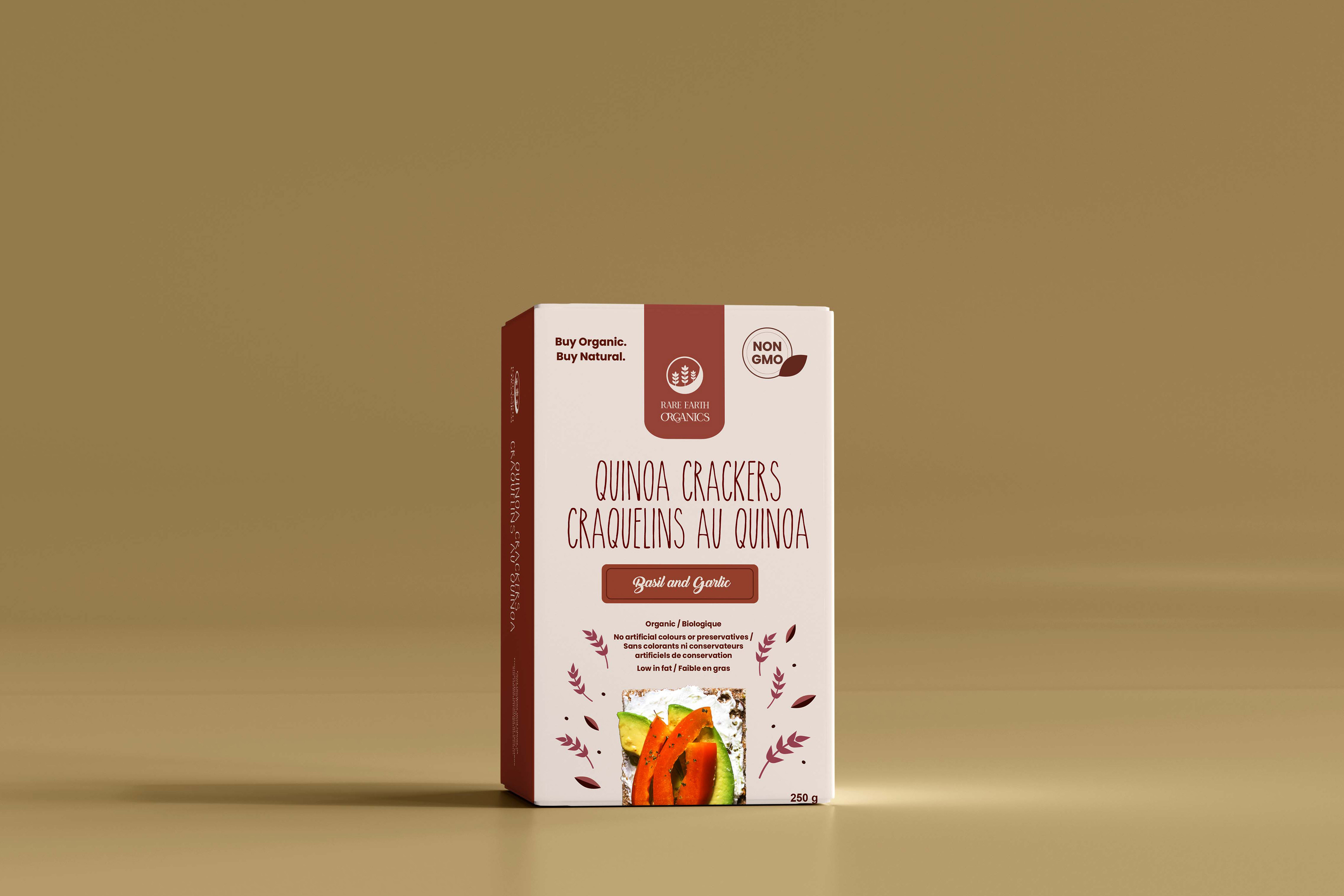
I chose to design my packaging on quinoa crackers because quinoa is a grain and organic, good-for-you crackers have become more common/popular and are a good alternative to other cracker brands that aren’t so healthy. Quinoa crackers can be versatile in flavours, if more flavours were to be sold then the colours of certain elements on the box like the wheat, leaves, and rounded rectangle behind the flavour name can be changed to portray them.
The reason why I chose this colour scheme is that I wanted to use the colours of quinoa. To achieve this I used a photo of a quinoa field and pulled colours from that. I chose to do two of the same panels for each side so that if it's faced either on the shelf the English and French version are easy to find, with the only exception of the flavour name because it would have taken up too much space on the face panel. The logo is a quarter moon with wheat protruding from it while staying within the containing shape of the circle. The reason that it’s a quarter moon is that it is the best moon for harvesting. I used the brand’s guidelines to aid my decisions. I placed the logo in the top center to make it stand out from the rest of the information. I chose to put most of the information down the center of the face panels so that it would be easier for the consumer to read.