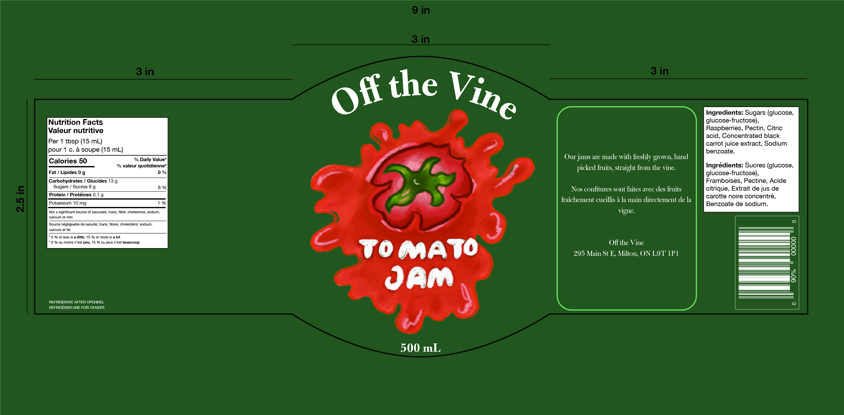
Jam Label Packaging
Design Studio, Packaging Fall 2021
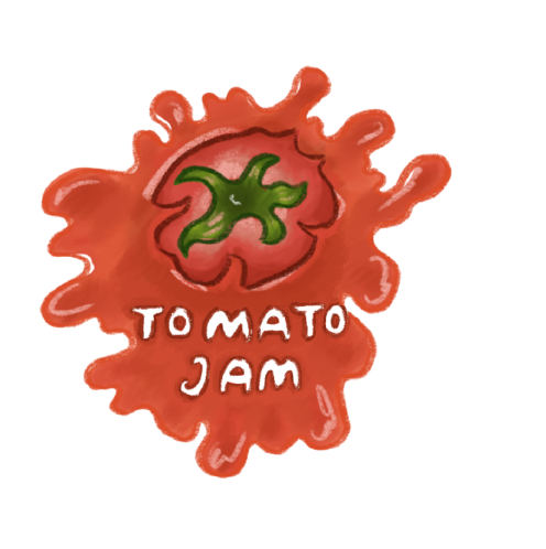
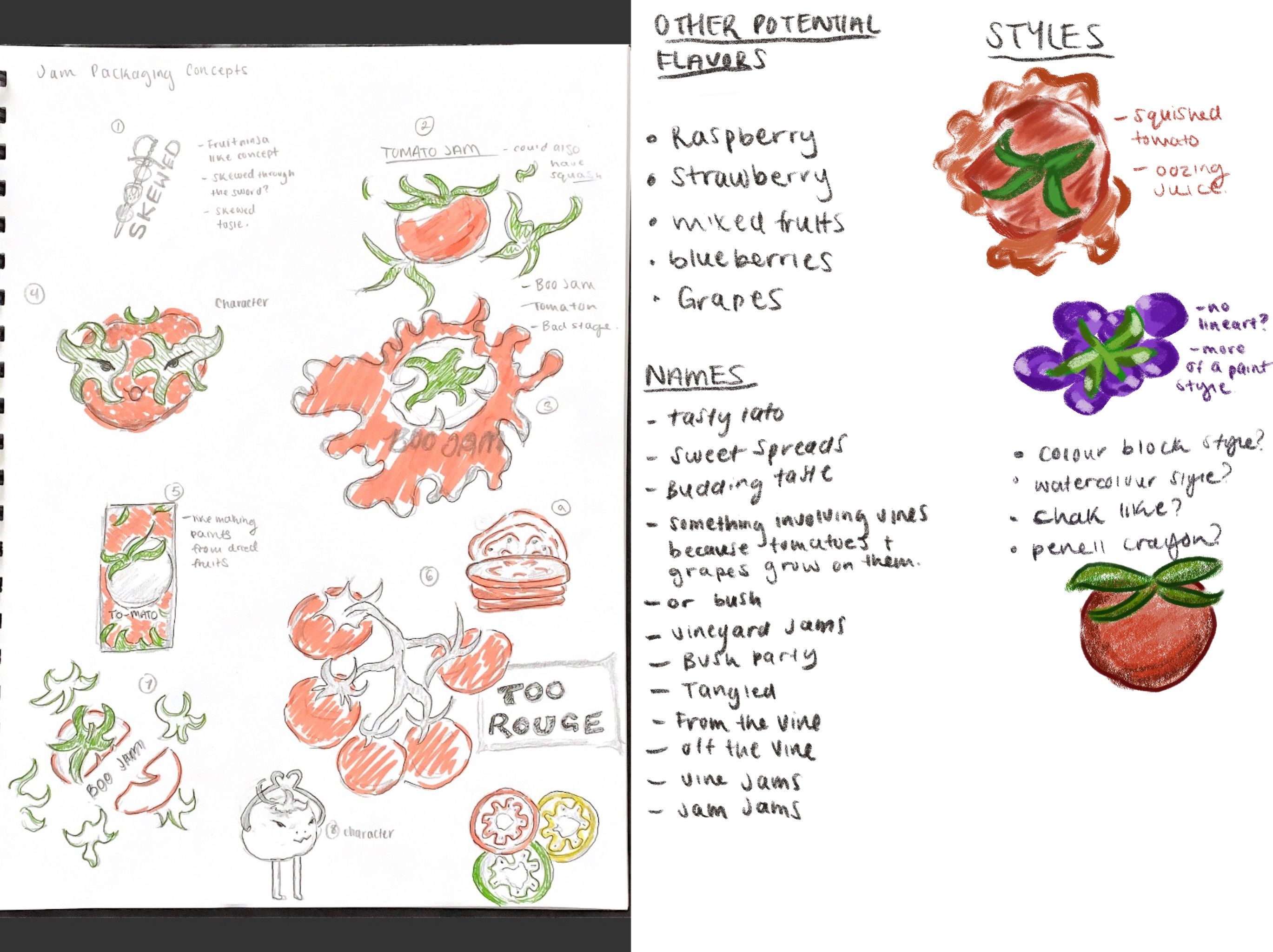
When we were first introduced to this project, the first thing I did was choose the first flavour that I wanted to do. Since, I don’t really like jam that much I wanted to do a fruit that I don’t see as often so I chose Tomato jam.
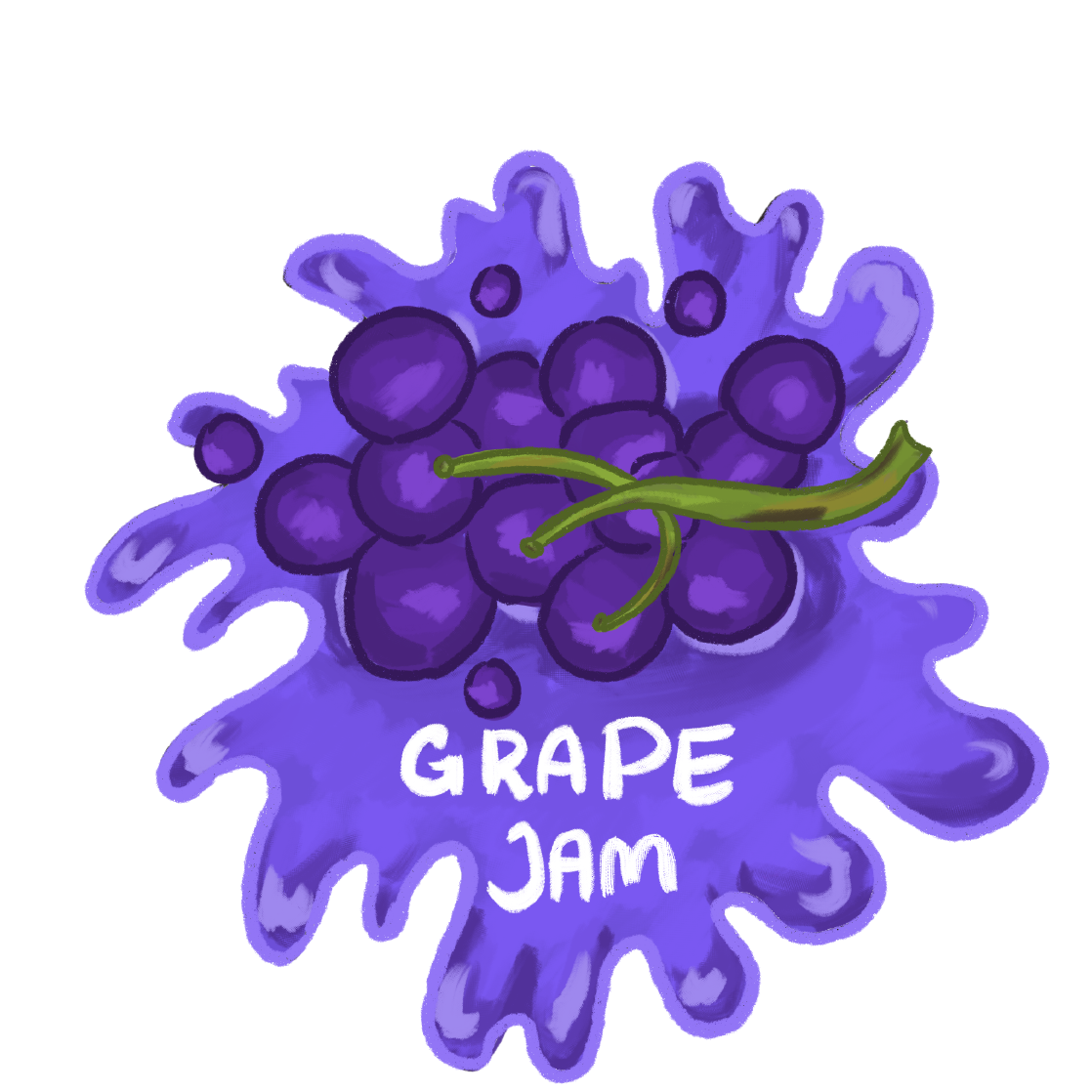
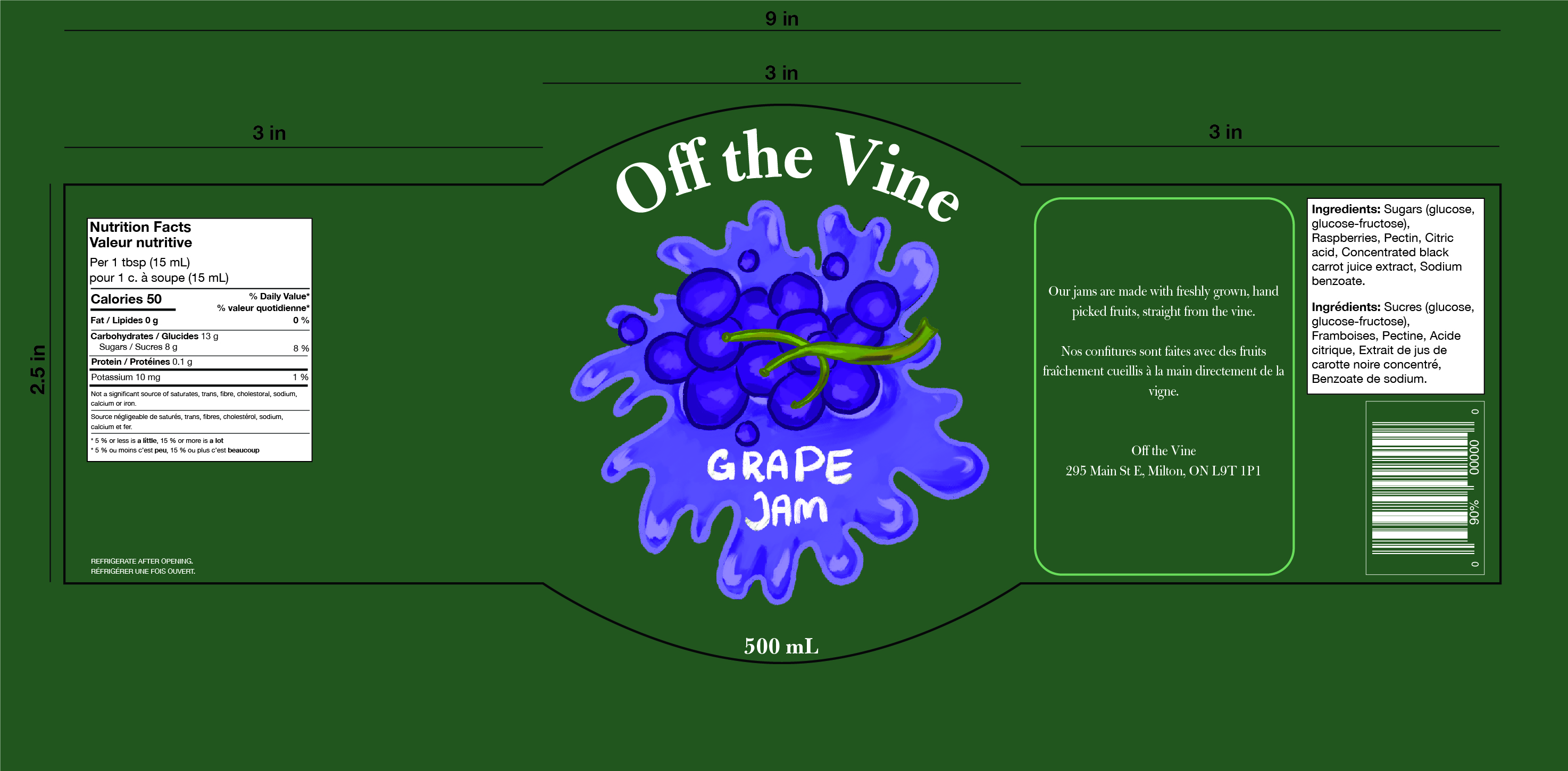
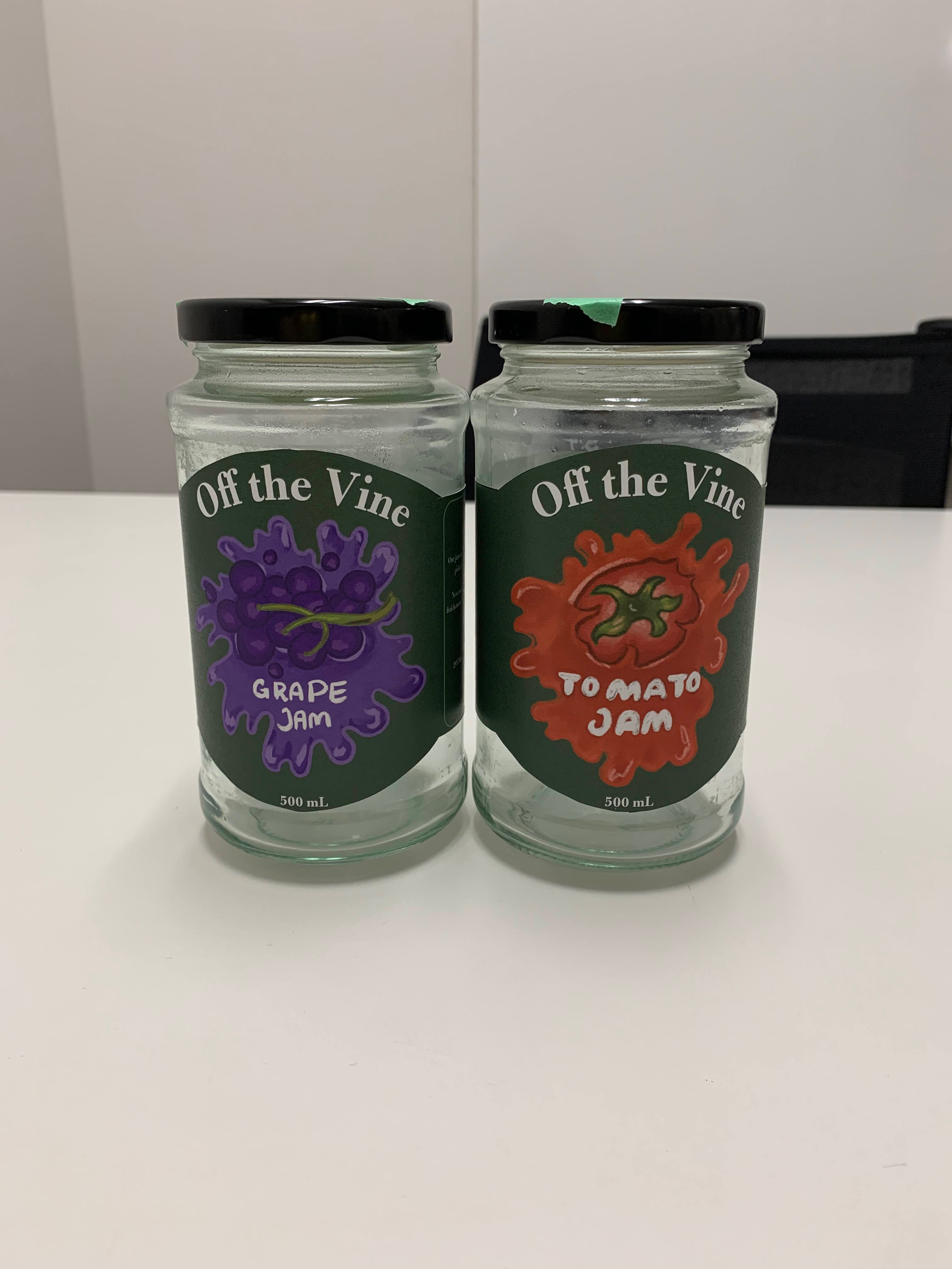
For the illustrations, out of the 8 or 10 concepts that I did, after feedback I went with the one where the tomato is being smooshed for lack of a better word and looks messy and like the insides are oozing out. For the flavour it would be paired with I chose grapes because give they same messy, exploding feeling as the tomatoes do when they’re being eaten. For the illustration style I decided to do more of a detailed almost painted style with lots of highlights and shadows.
As for the type that’s on the labels, Bulmer MT STD, I chose it because I thought it would pair well and contrast well with the handrawn type I did for the flavour names, which I made to look as though someone took their finger and wrote the words in to the background behind the tomato and grapes to tie in with the messy style of the illustration. Lastly, for the dieline of the label, I was inspired by Smuckers jam jars, where they have a semi-circle where the product identity and logo goes. So I did a full circle in the middle for my label to fit the circular shape of my illustrations better.