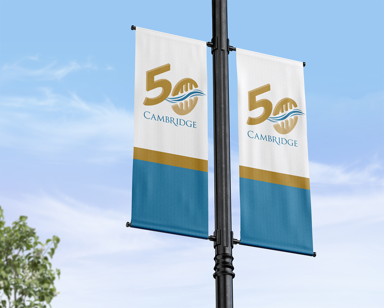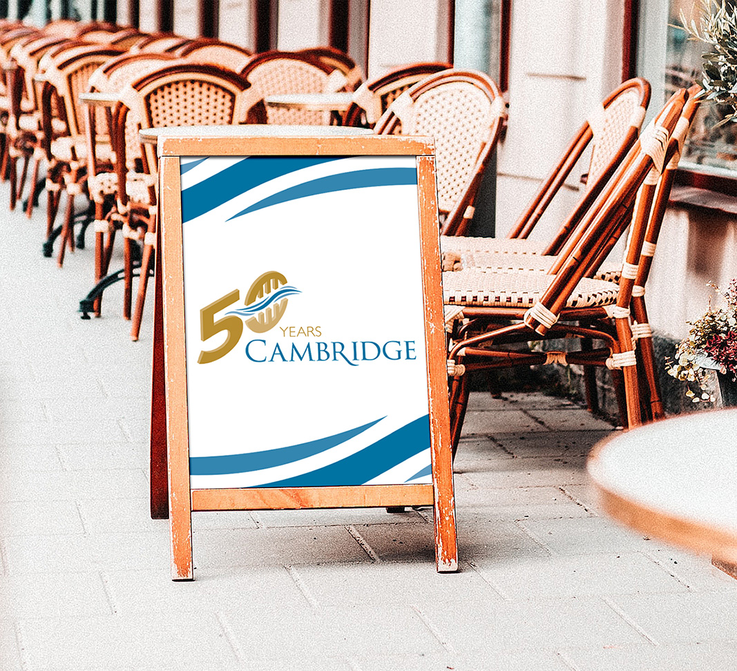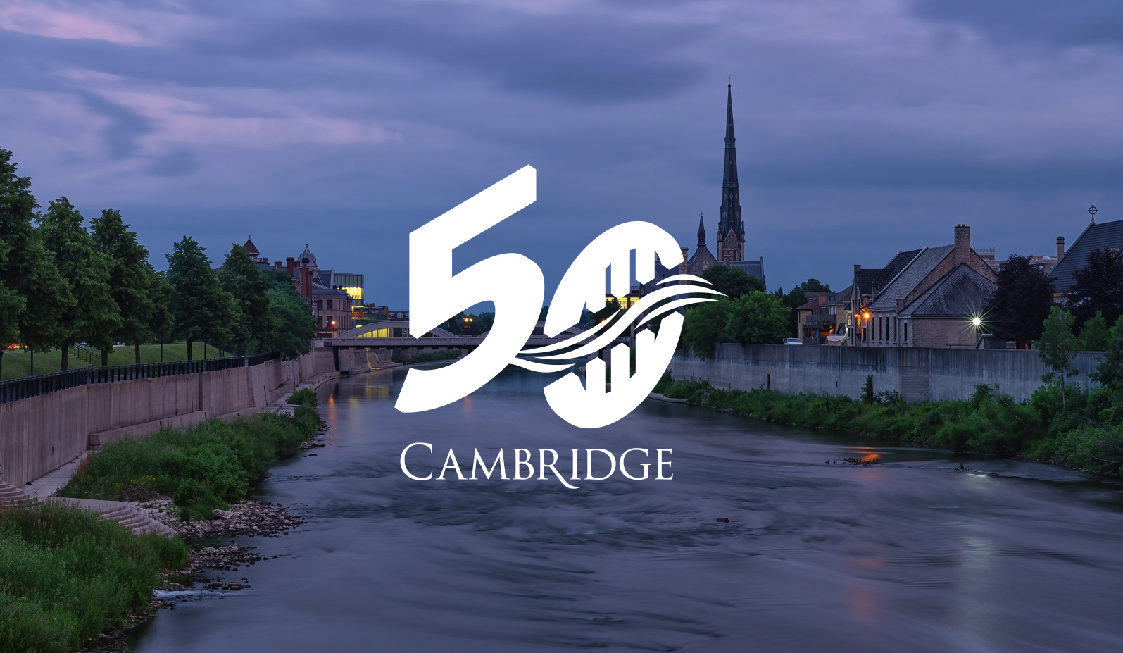
City of Cambridge 50th Anniversary Logo
The City of Cambridge worked together with our class to design logos/identifiers for the city’s 50th anniversary, one of which will be selected by the city council to represent the landmark event and work in harmony with their existing logo and identity.
I worked in collaboration with a first year student, taking on the roles of creative director and lead designer to concept and create the logo. The logo concept and research process was a collaborative effort, gathering information and insight into what makes Cambridge unique and special to those who call it home. Once a strong, suitable concept had been achieved, I created the final vector version of the logo. We also put together an accompanying brand and usage guide, using a harmonized style and direction to show how the logo relates to the city’s existing identity.
Both the colours and the isometric style of the design were chosen to work in harmony with the existing city logo. The principal graphic of the logo is the “zero,” which uses the imagery of the city’s iconic bridge and it’s reflection in the water to form the complete character, divided by the flowing river in between them. These three core elements were used to visually represent the three separate towns that make up the City of Cambridge.
It was a fun, yet challenging experience to work with a newer graphic design student as a sort of mentor, and to help them create and refine their concepts. It was an enlightening experience as well, as it demonstrated to me how much we had grown as designers in just one year and how both parties can learn from each other, despite the difference in experience.