Hill & Sons Brew Co.
Packaging | Branding | Illustration
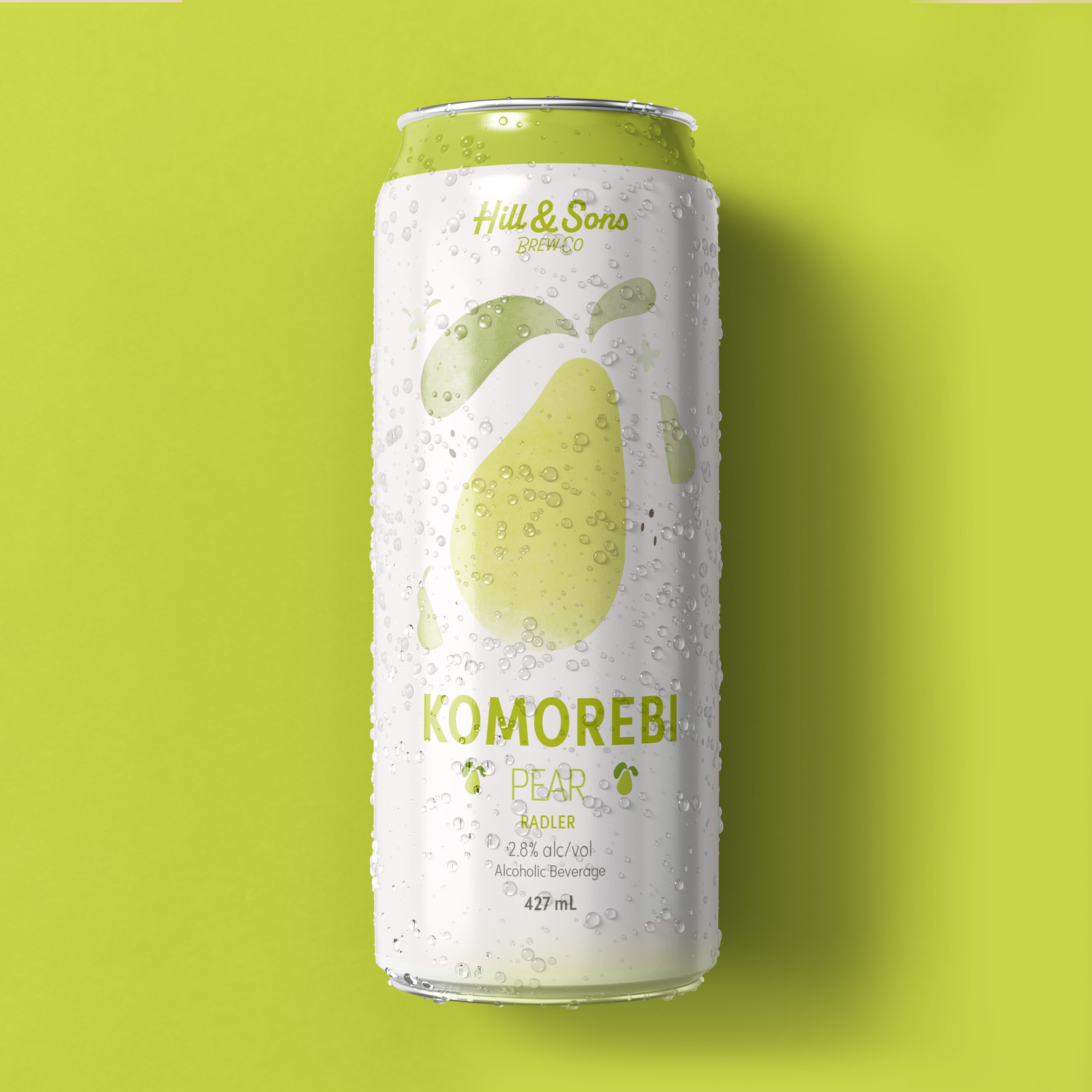
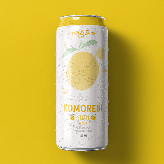
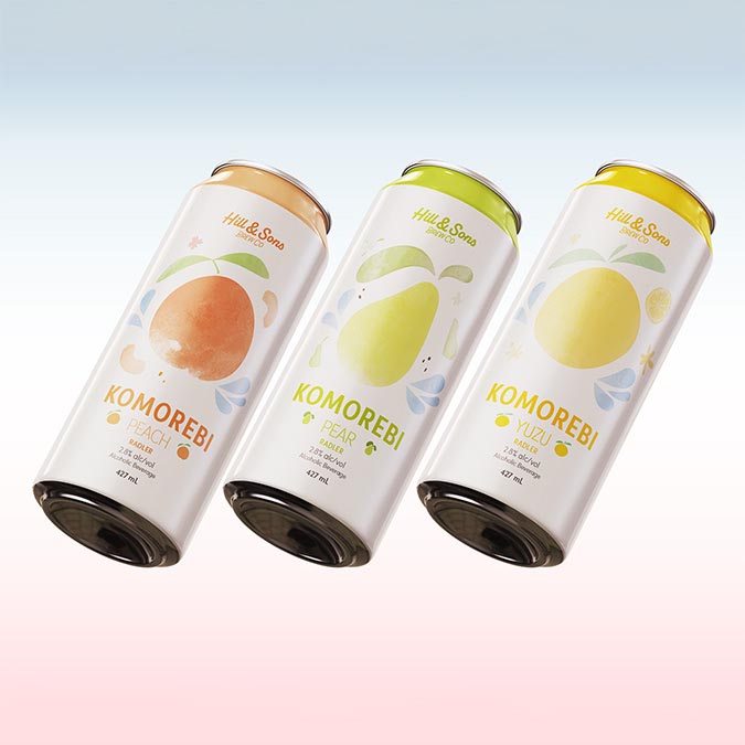
This was a project for a fictional brewery, Hill & Sons Co.
These cans were created with the thought of communicating the ‘big flavour’ the flavours exude. The cans were coloured based on the colour of the fruit, and because “Komorebi” means sunlight filtered through tree leaves.The labels displayed the leaves of each fruit tree, the flower, and the fruit itself to tie it to the brand name.