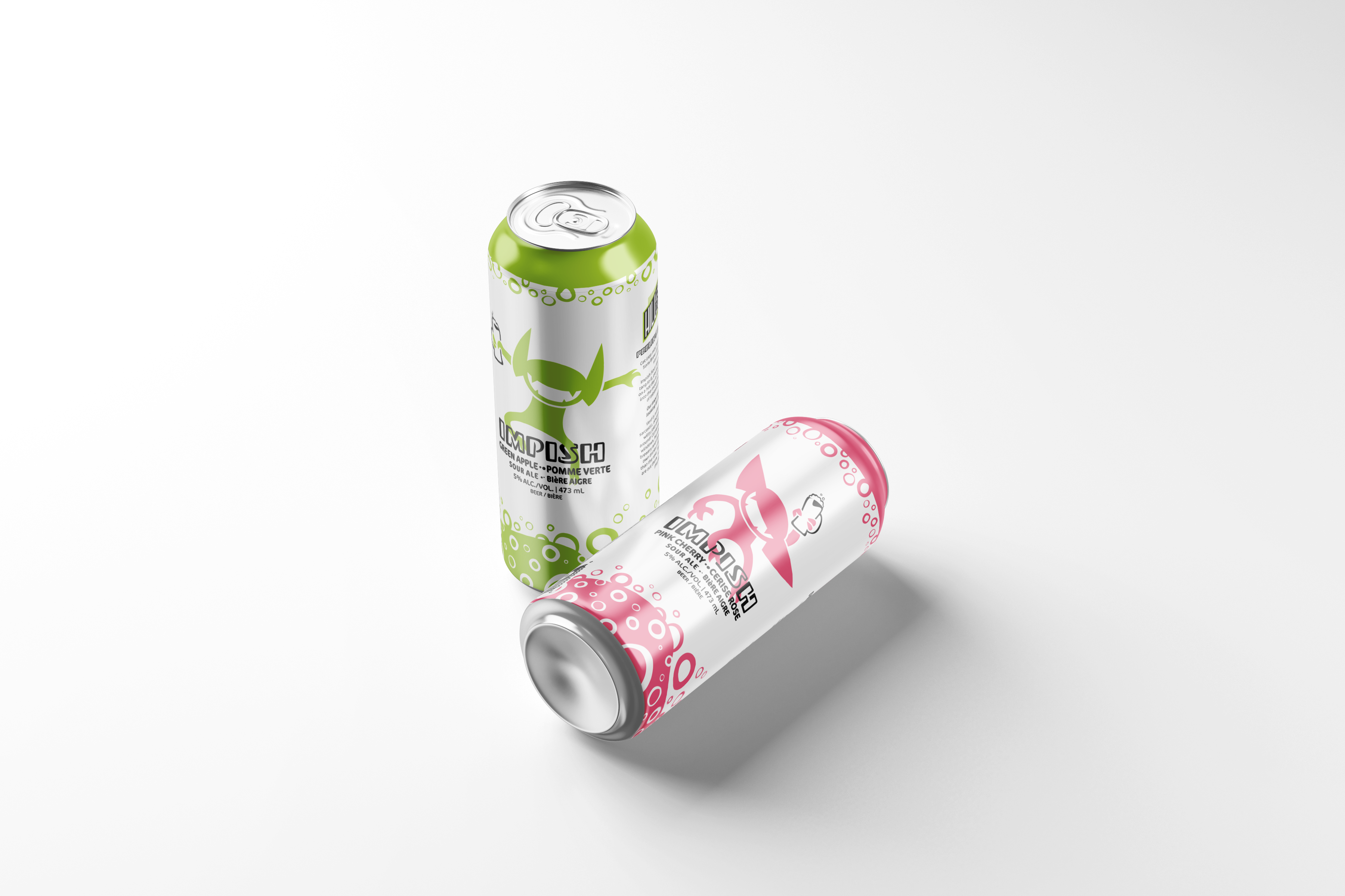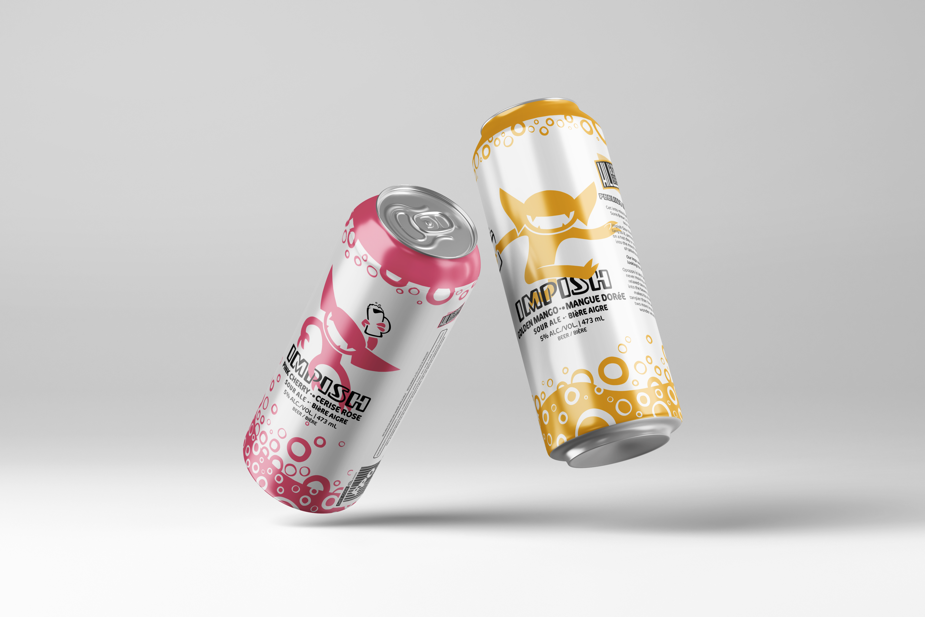
Beer Can Branding
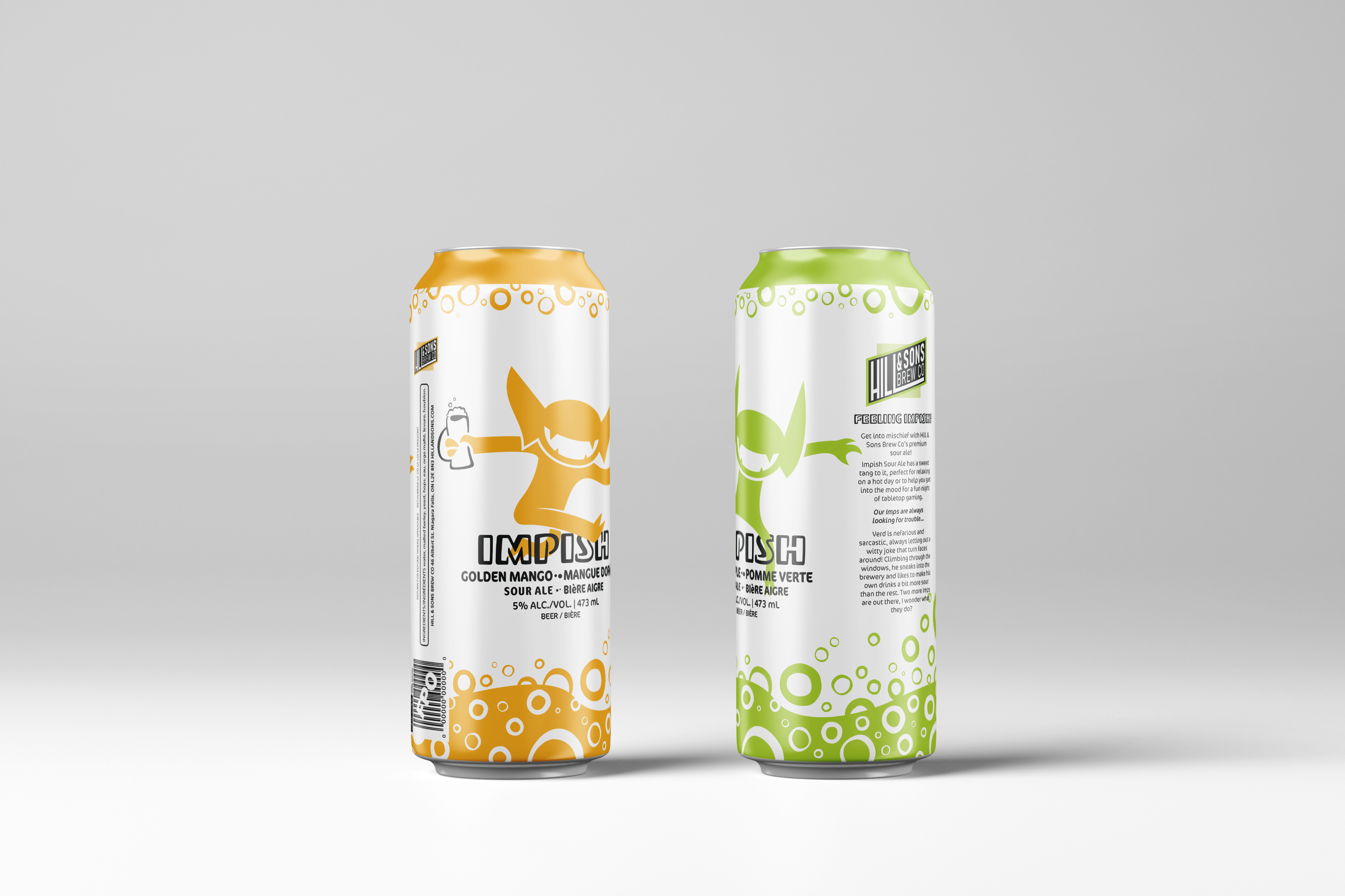
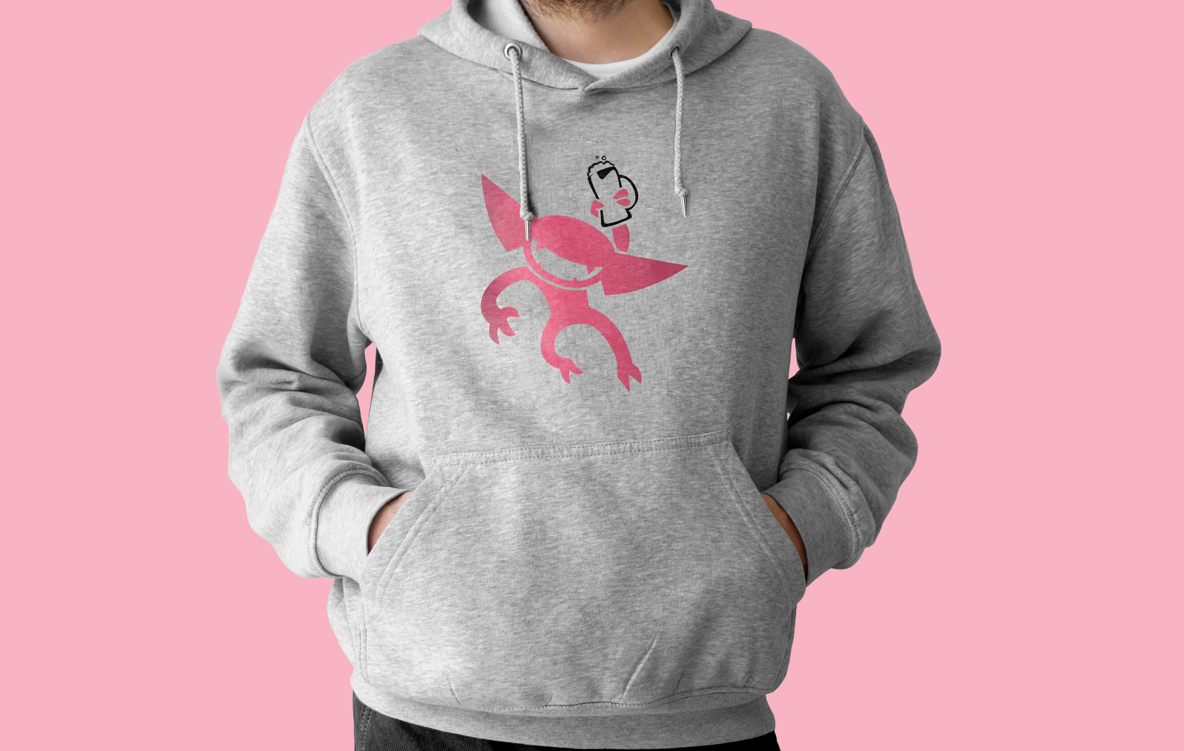
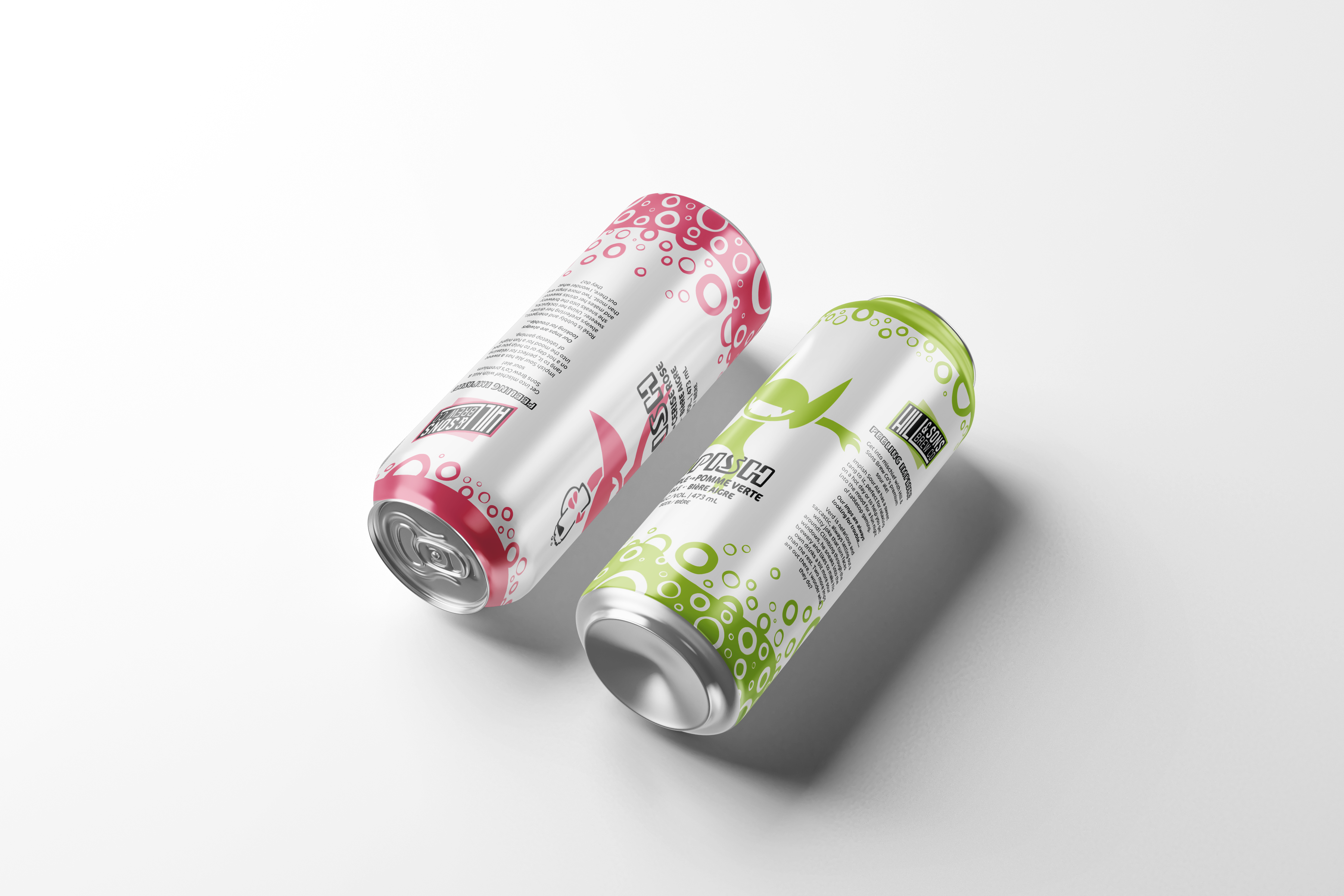
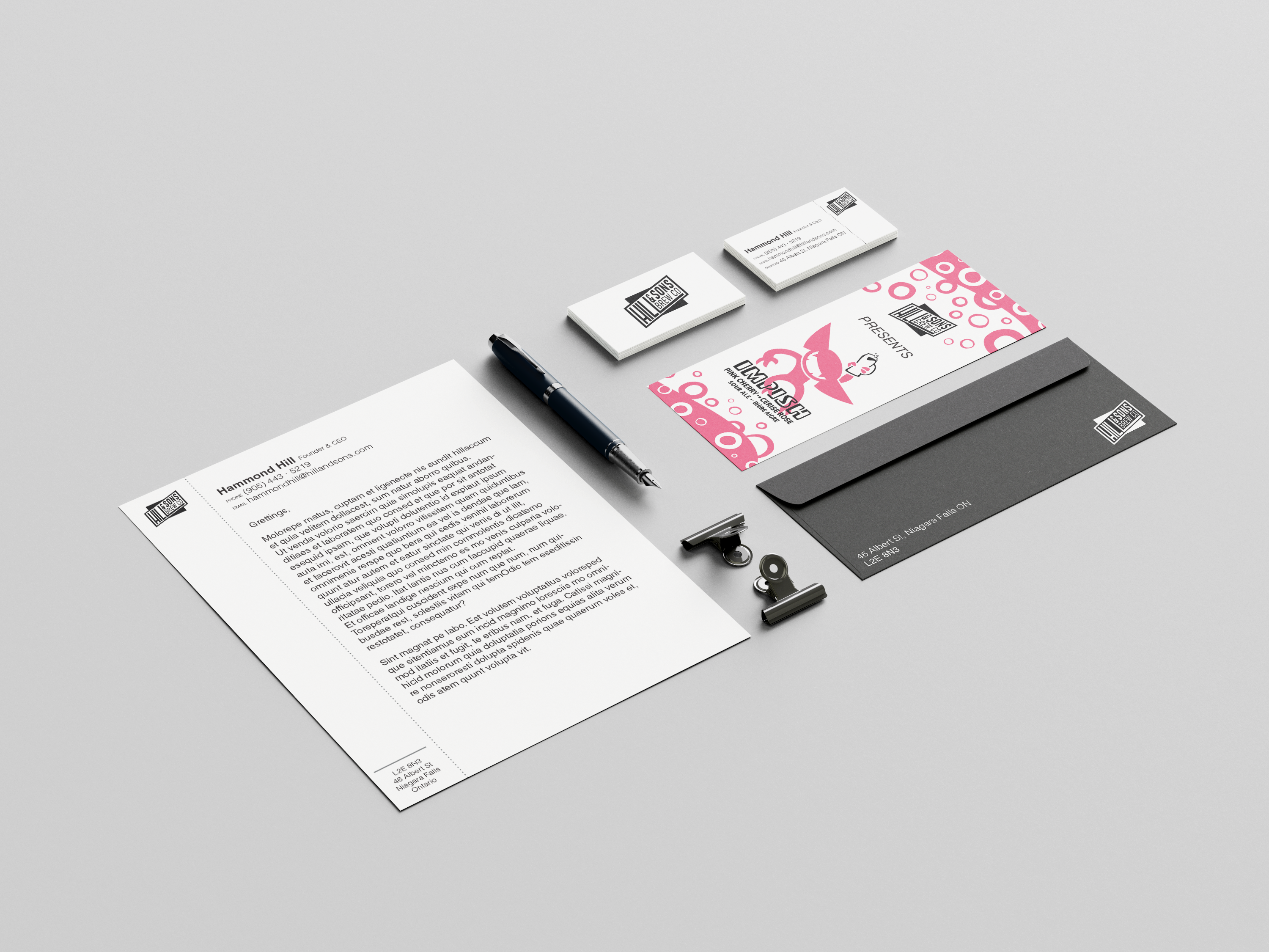
This speculative assignment was to create an effective brand and line of beer cans for a fictional client, Hill & Sons Brew Co. Over the course of a few months I developed a series of three cans, a box, and a brand guide. This eventually led into a series of three cans, a box, and a brand guide. The initial pitch for the beer was “for dungeons & dragons players,” which stayed as a subtle focus throughout the designing process. However, the scope eventually spread to also encompass young adults from 19 - 25 years old. D&D has become increasingly popular among this target demographic, which allows for wider spread of appeal. The characters on the cans are simple and iconic, with each one being a different bright colour that matches the flavour profile of the drink. Illustration was chosen as a design method, as it can quickly be recognized. When the project ended and was finally submitted, I found that the biggest hurdle of the project was just fitting all of the aspects of my design neatly onto the can! It quickly becomes difficult working with what little space a can provides, especially in the case of making sure that the can is recognizable from any angle. This becomes even harder when elements such as ingredients, legal text, and barcodes need to be integrated into a design. In the end, these challenges were overcome and resulted in an effective sour beer can. Brand guide available by clicking here! Flat art of the cans and box here.