Cambridge 50th Anniversary
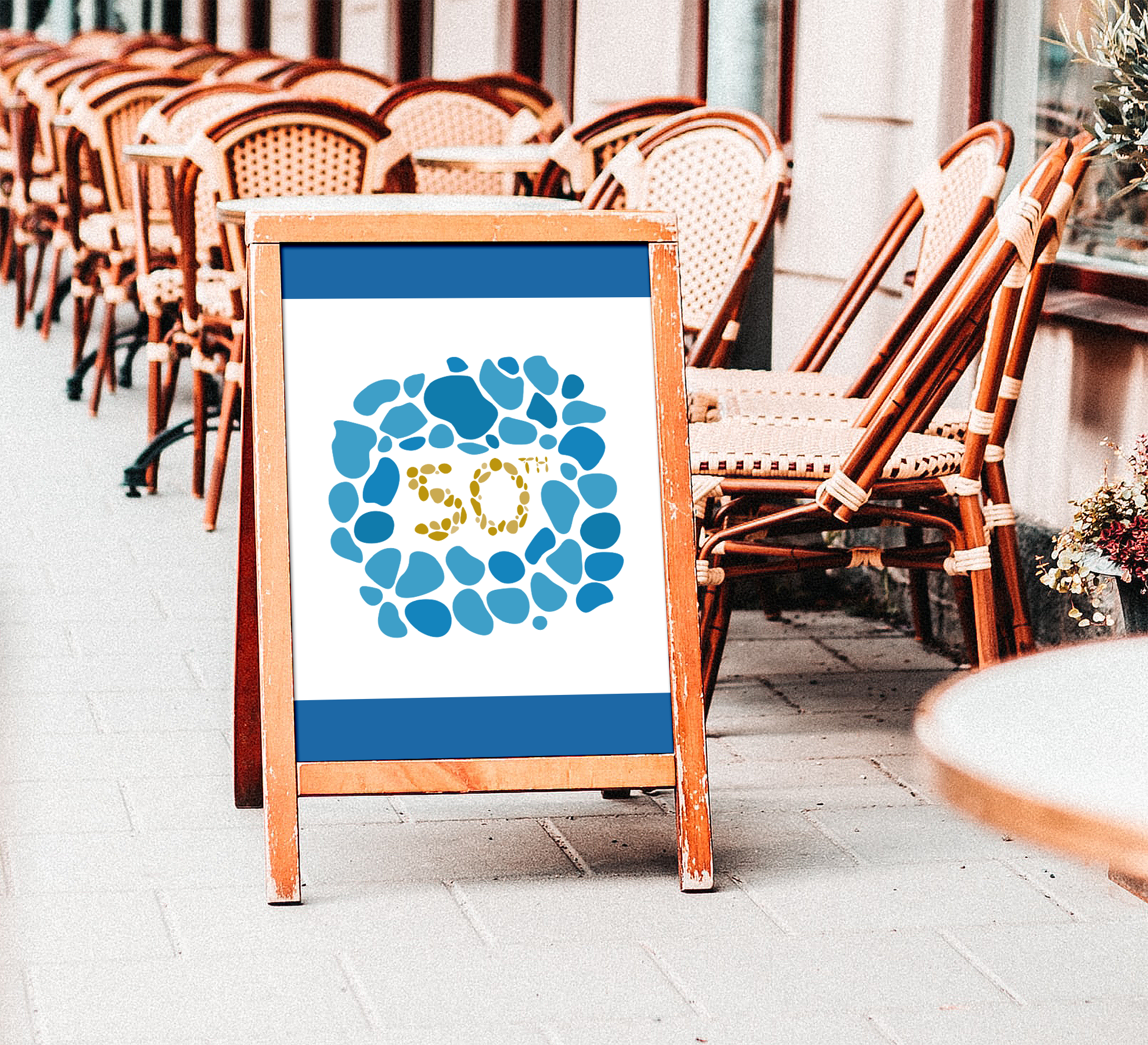
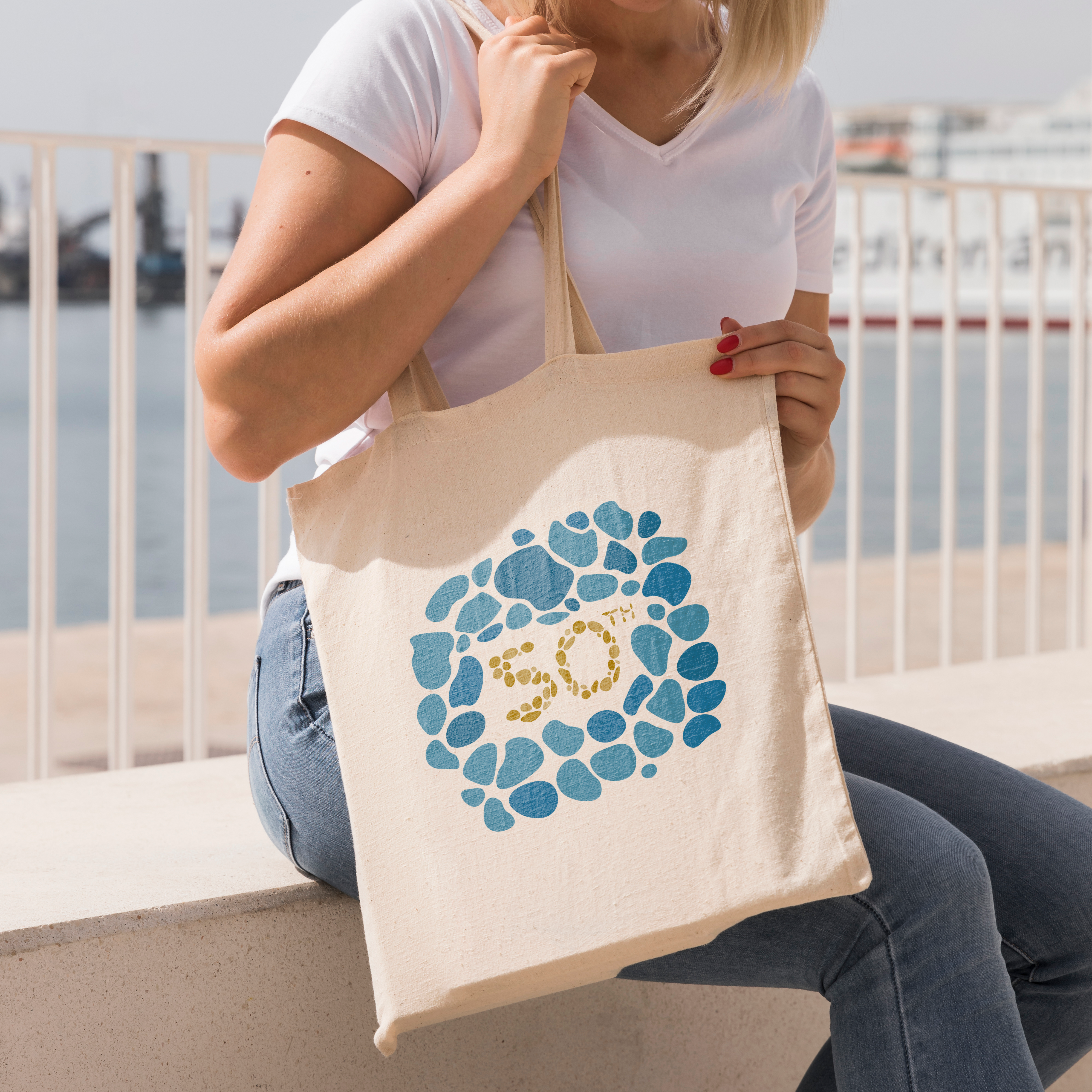
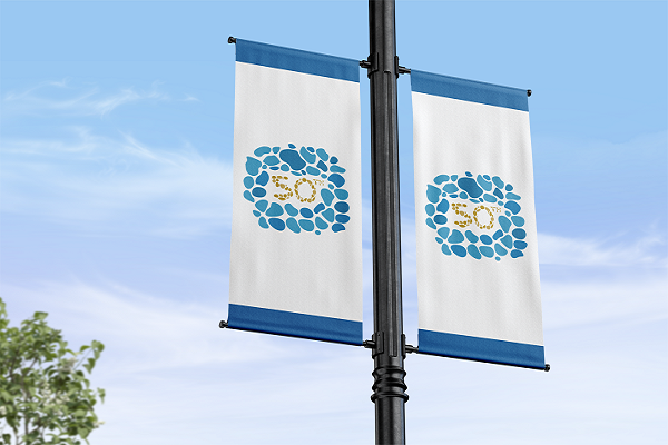
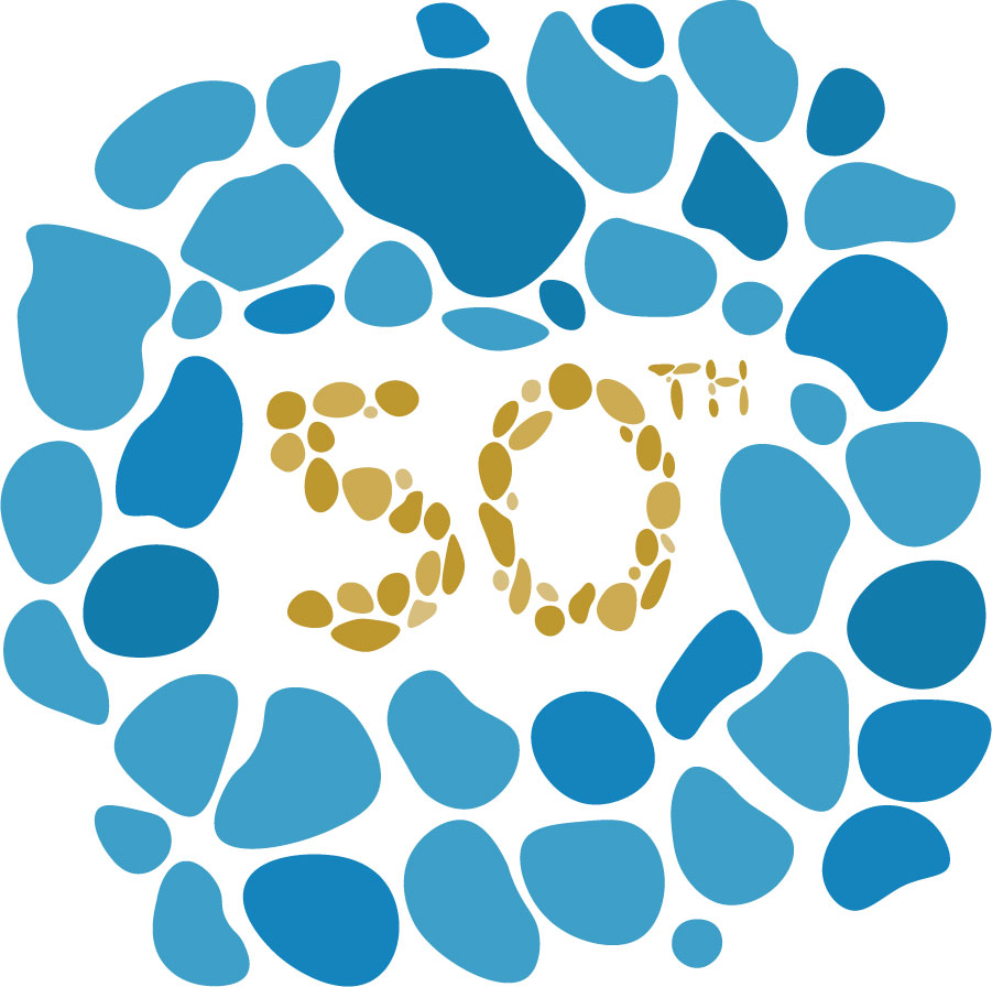
The City of Cambridge assigned a team of student graphic designers to assemble in pairs and develop an effective logo for their 50th anniversary celebration. Over a month, my partner and I researched and concepted different routes to take our design. At the start, we looked at bridges; Cambridge is built on a river, after all, and bridges are a large aspect of the town’s infrastructure. However, when looking at our fellow designers, we found that bridges were too common a theme and steered away from them. However, still wanting to relate to the river through the town, we decided on a different approach: river rocks! Using our client’s brand guide, we created a logo that represented Cambridge’s heritage and their future. The design of the golden 50 actually contains 50 rocks, noticeable to whomever decides to take the time and count. The hand-lettering of the 50 makes the design feel friendlier. The most challenging aspect of this design process was working with a limited amount of critique from the client. It made it difficult to direct towards a focus, so my partner and I needed to create our own. Overall, our design was effective and iconic.