Hills & Sons
Project: Brand Identity, Typography.
Class: Design Studio, Packaging.
Semester: Winter 2022
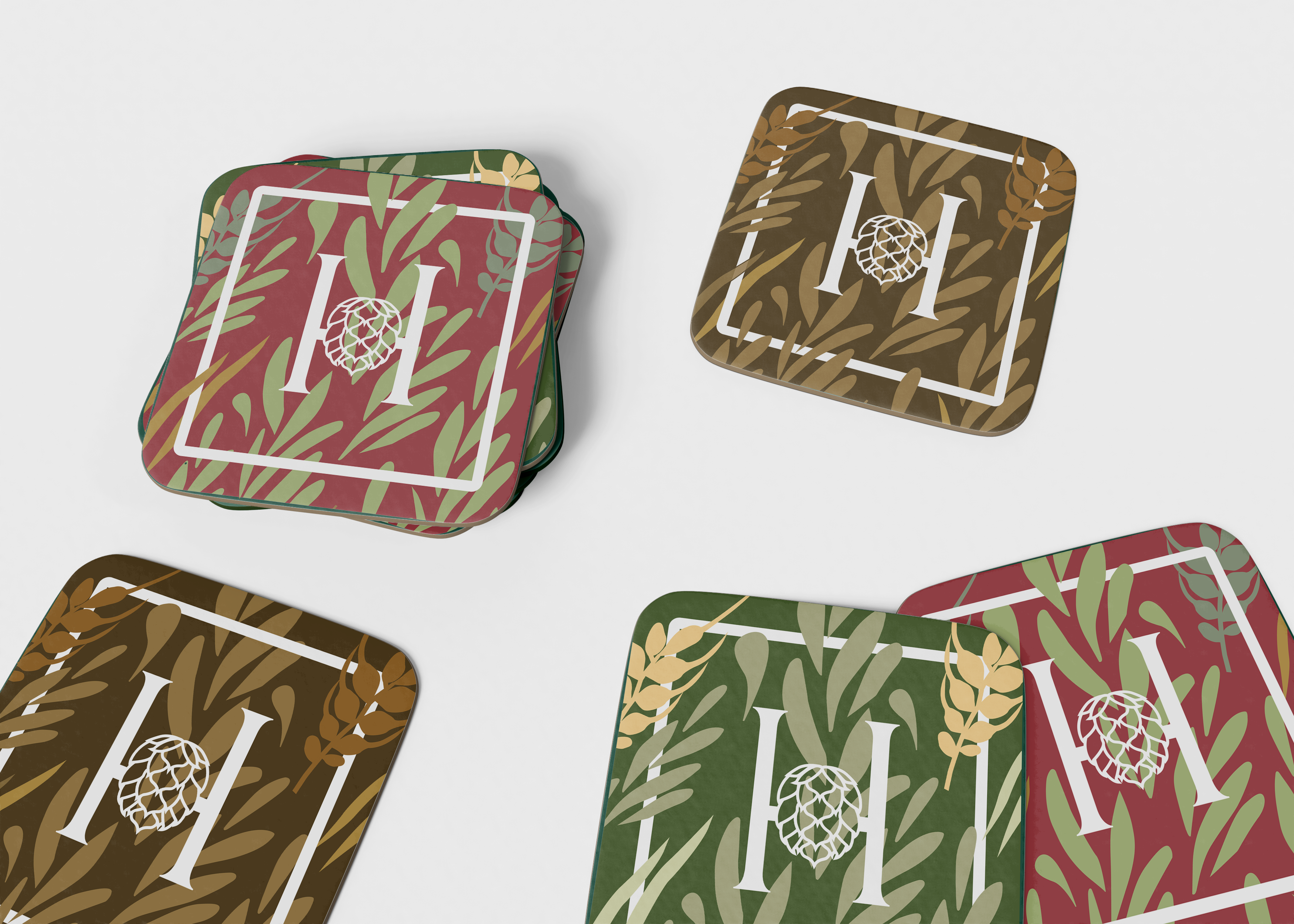
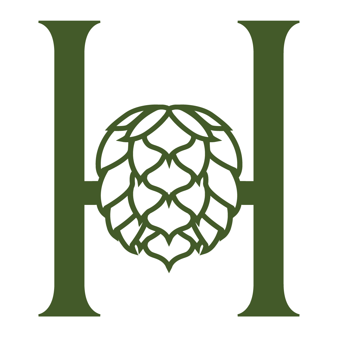
Utilising the design principle of balance I illustrated a hop icon that is symmetrical on both sides, mirroring the symmetry of the ‘H’ and keeping the composition visually balanced. The use of a serif typeface exhibits elegance and class and has directed the intended target audience (women ages 19 – 30’s). The points of the serif complement the points illustrated within the hop icon. The stem of the capital ‘H’ creates visual leading lines toward the hop, further pushing the focal point within the logo. This leads the viewers’ attention directly to the hop.
