Hill & Sons
Project: Company Brand Guide & Beverage Branding
Class: Typography, Packaging
Semester: Winter 2022
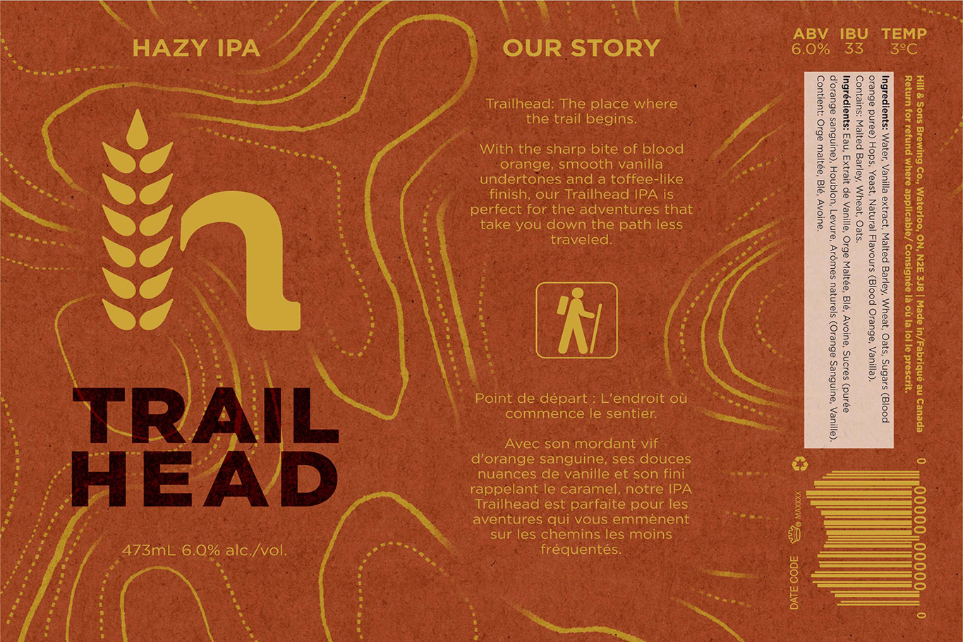
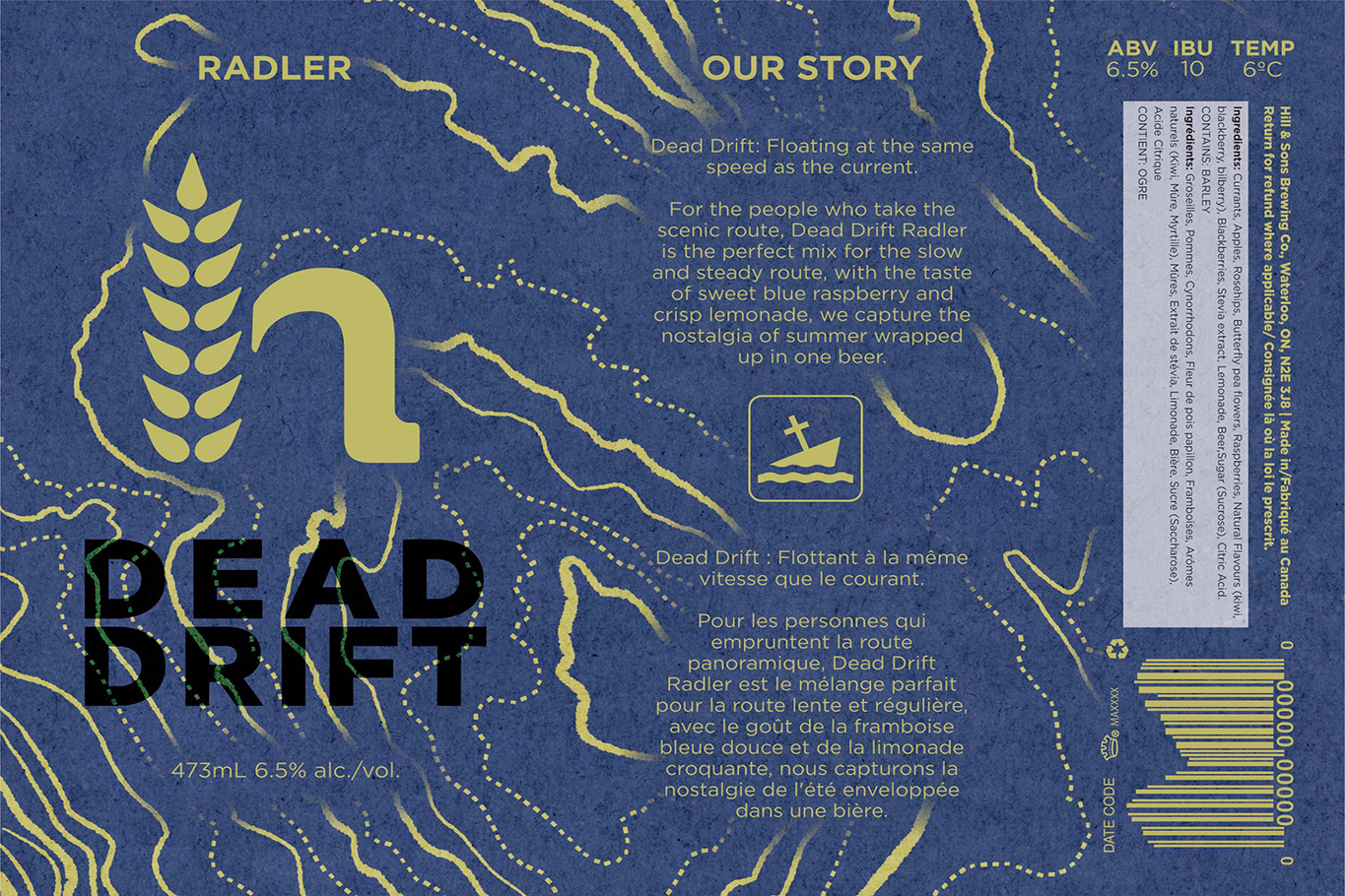
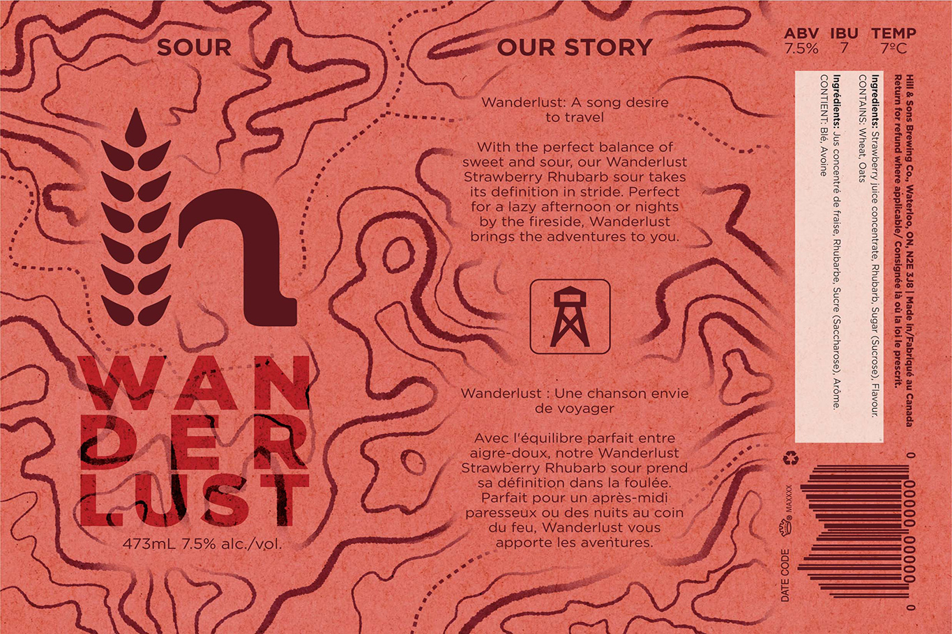
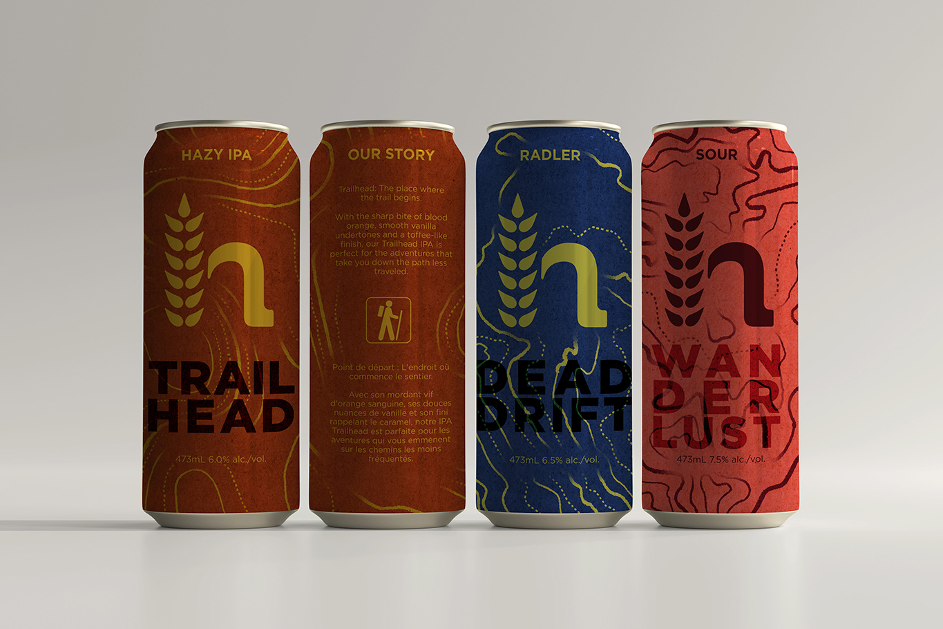
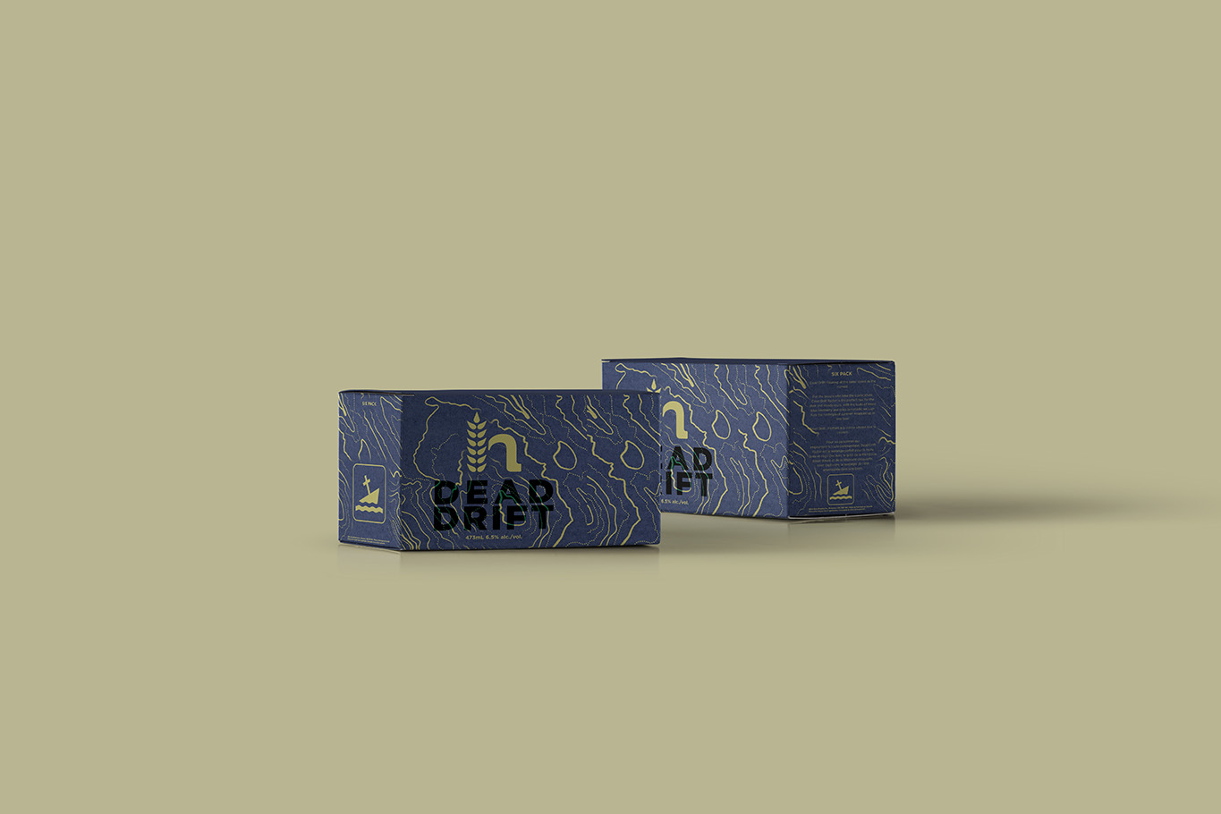
This project was composed of two main components, the re-branding of Hill & Sons Brewing Company, and creating branding and packaging for their product offerings. Hill & sons is a Kitchener- based brewing company that cultivates a community environment for others looking to step off the beaten path of mass-produced beer. Hill and Sons keep it current by aiming their target market to young and upcoming individuals looking for bold and adventurous flavors that bring the experience wherever you go.
The goal for this project was to assist in this fictional company’s rebranding, as well as create new product offerings that would work cohesively with the company’s new theme and brand. I designed the Hill & Sons new Corporate logo, illustrated and designed their new product offerings and other items of importance. I worked with my professors to create a cohesive visual theme, and illustration style that would be reflected on the product offerings. The brand identifier typeface was chosen for its bold nature and classic look, and as it compliments the clean type choice on the cans and other offerings.
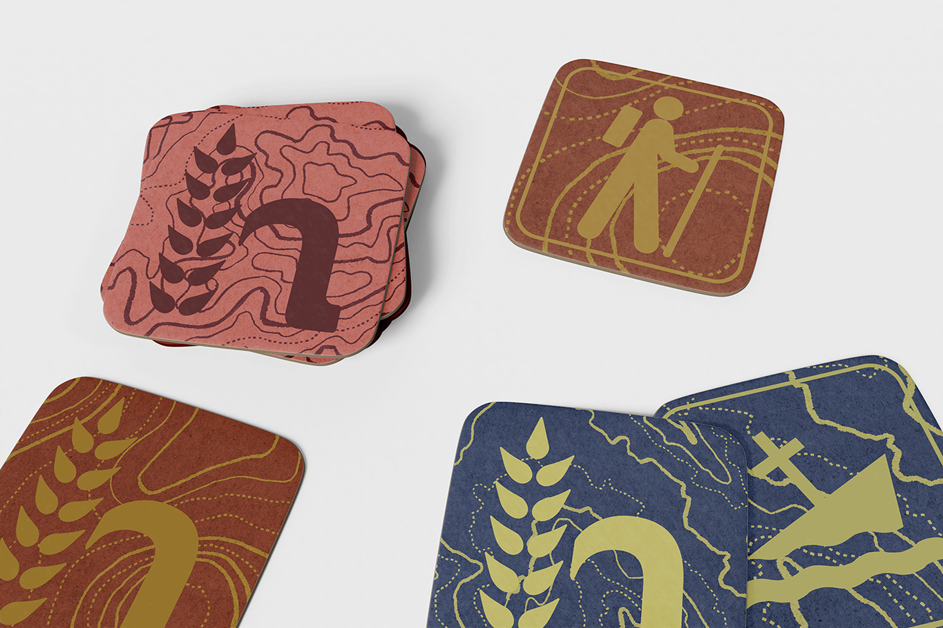
The decisions to use a textured background pulled on the original concept of adventure. The illustrations on the cans are hand-done in a style that mimics the concept of topographical maps, as well as the icons on the back of the cans are symbols sourced from the national parks, pulling in more influence of the concept of “Adventure” for these cans.
